UltraTube is a high-performance steel tube engineered from advanced dual-phase steel for demanding automotive applications. As a specialist product brand, it needed an identity that could communicate technical precision, structural strength and reliability while remaining clear and highly functional within an engineering-led environment.
Studio Nine developed a contemporary brand identity design centred around clarity, performance and trust. Rather than relying on conventional industrial imagery, the identity uses a restrained visual language designed to reflect the precision and engineering expertise behind the product.
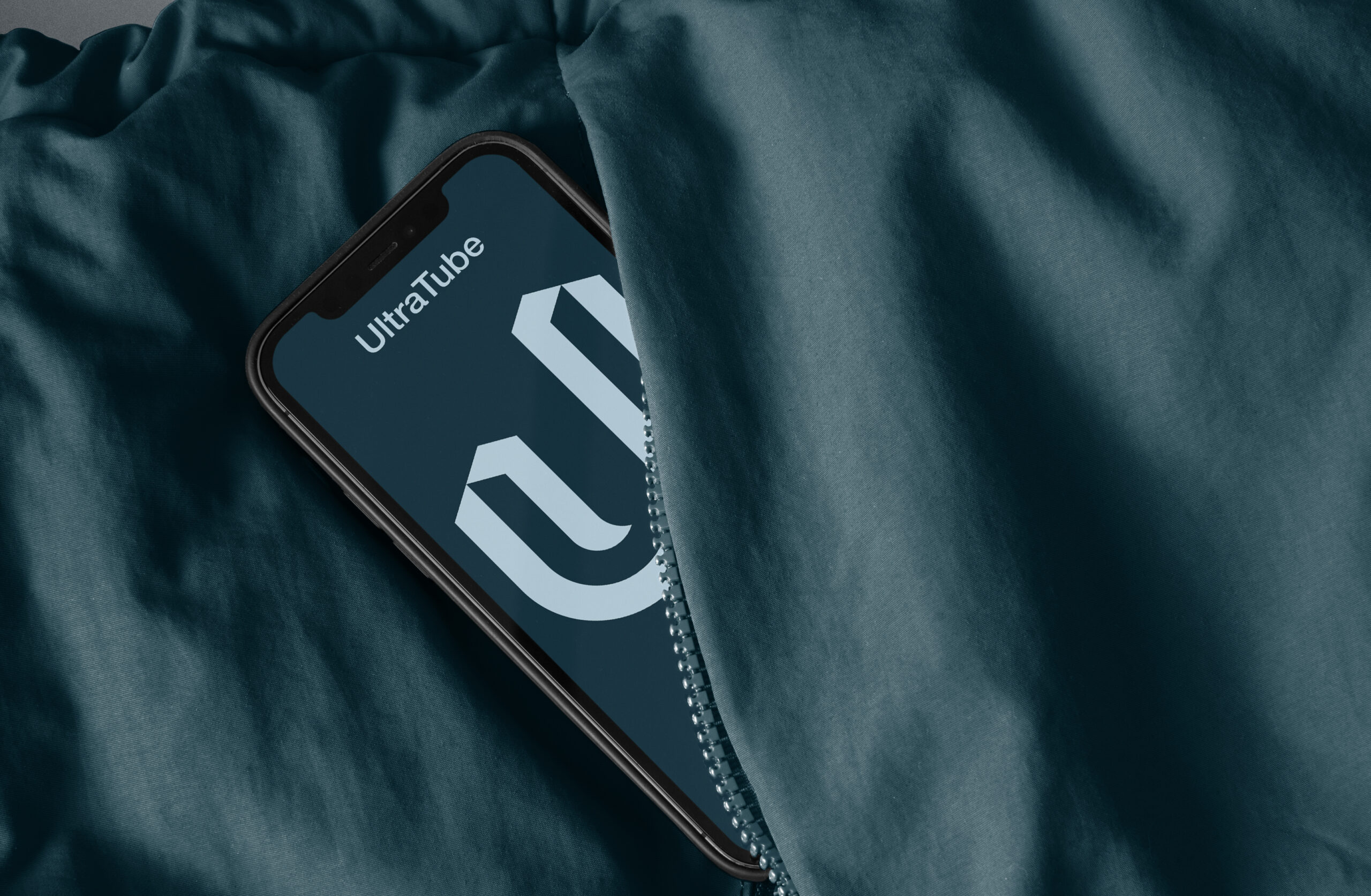
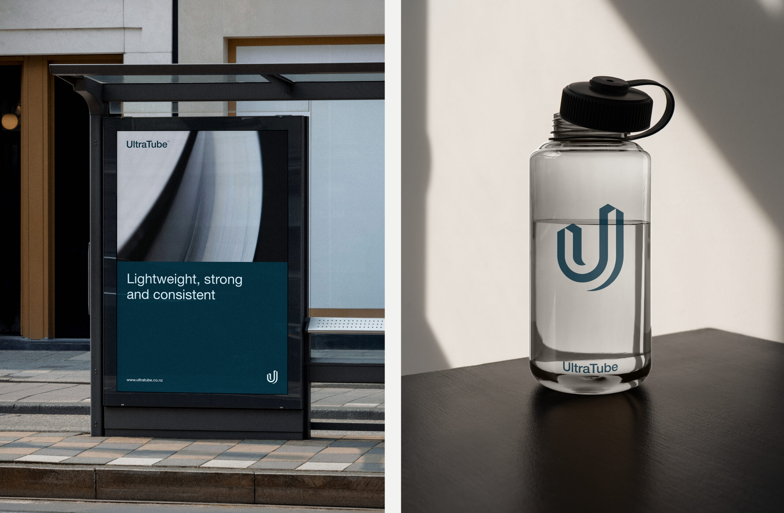
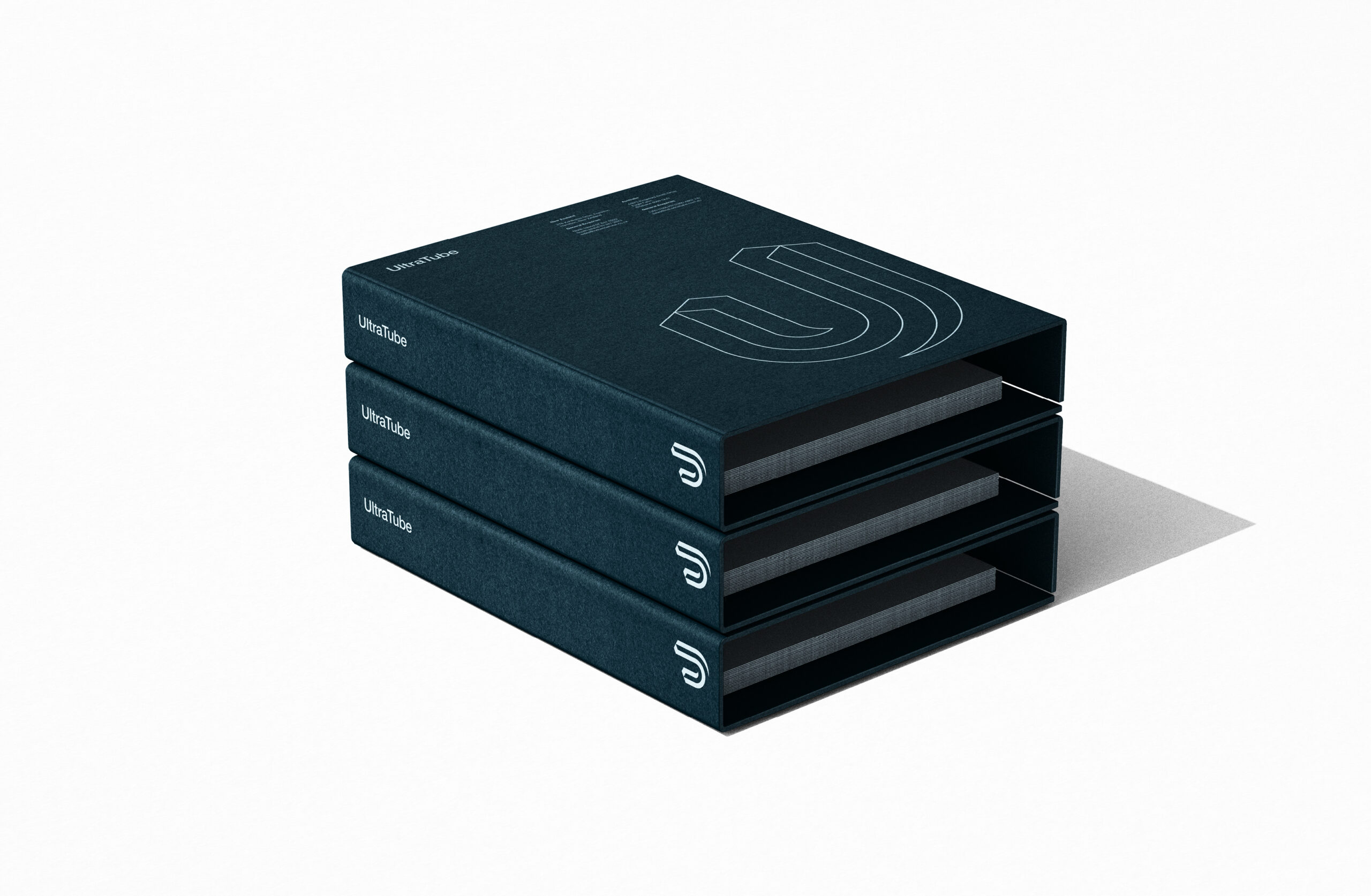
The logo combines a confident wordmark with a custom ‘U’ icon subtly formed to reference the profile of a steel tube. Its simple geometric construction creates a distinctive and recognisable mark while reflecting the accuracy and attention to detail inherent in the manufacturing process.
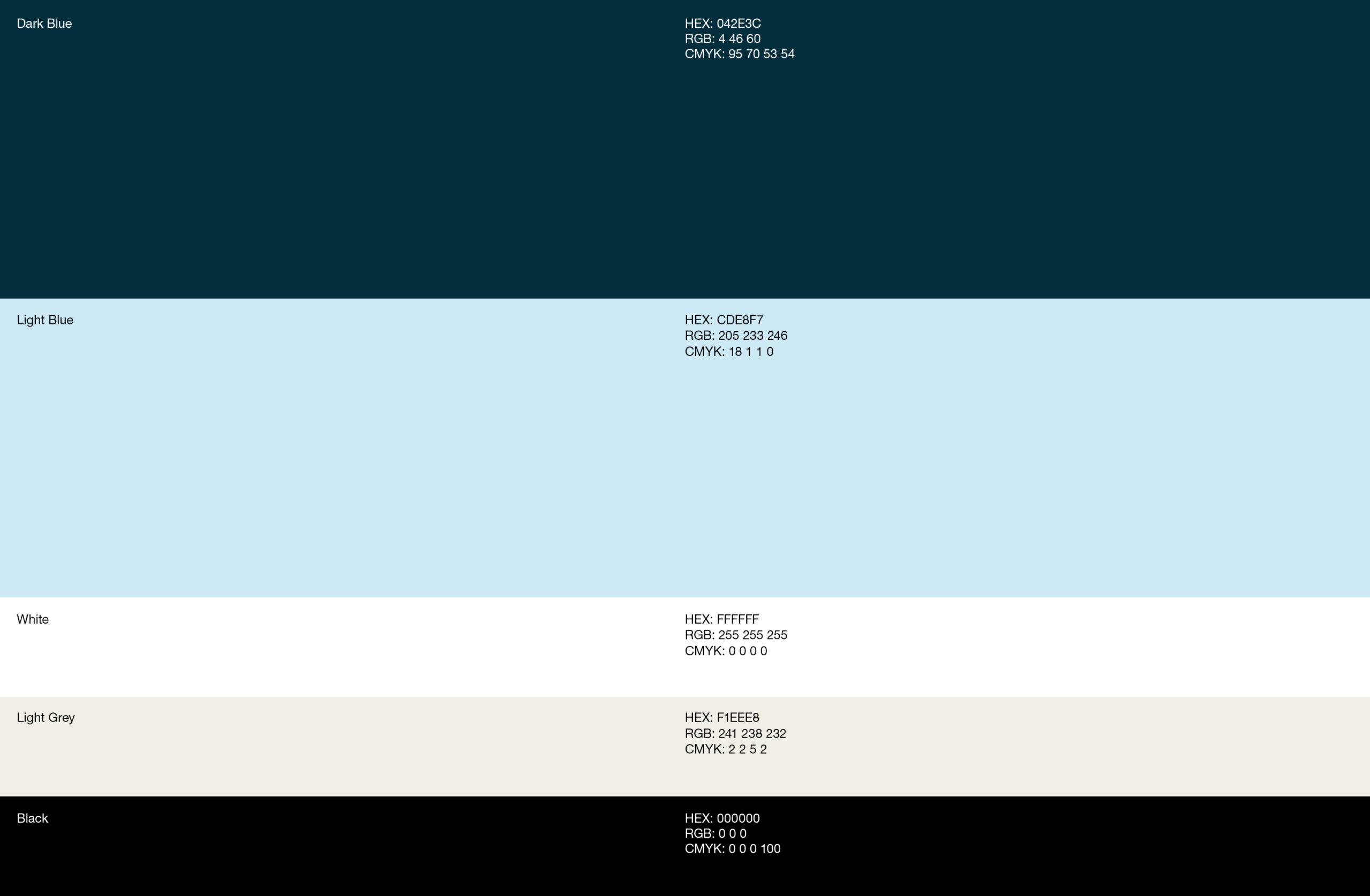
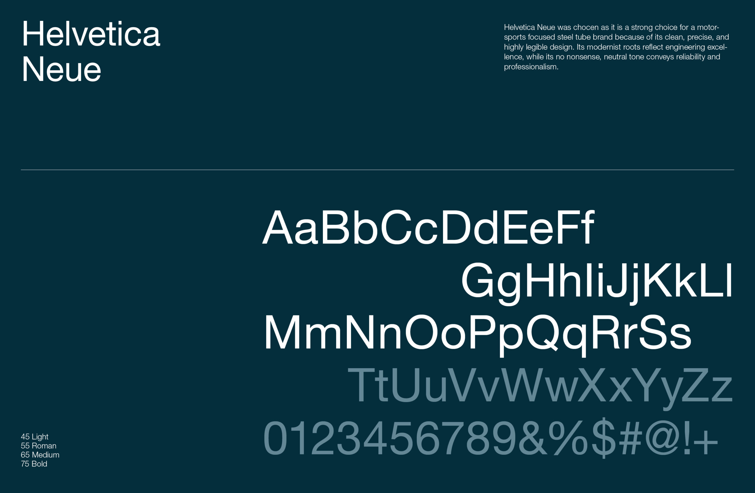
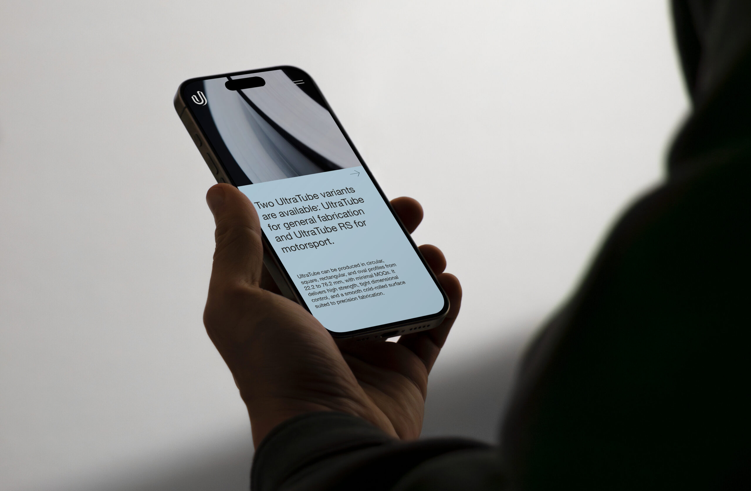
A technical palette of dark and light blues, supported by grey, black and white, reinforces the product’s engineering credentials while providing the flexibility required across different applications. Helvetica completes the system, bringing clarity and legibility to technical information across both print and digital environments.
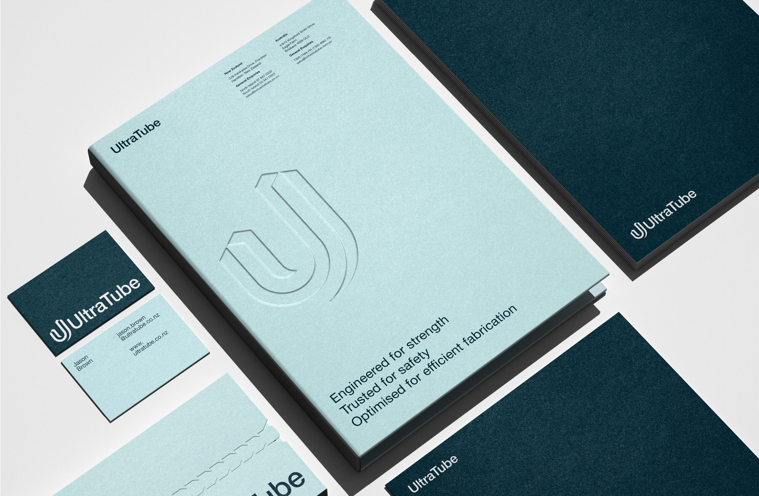
The identity was extended through graphic design across product communications and marketing materials, from technical datasheets and presentations to large-format applications. The resulting system gives UltraTube a consistent and professional presence while allowing complex technical information to be communicated clearly.
The result is a precise, functional and purpose-driven identity — designed to support the performance of the product rather than compete with it.