Made by Australian owned and operated Simple Drinks, Sømmar is an organic, all natural and sustainably sourced soda water from the Macedon Ranges in Victoria.
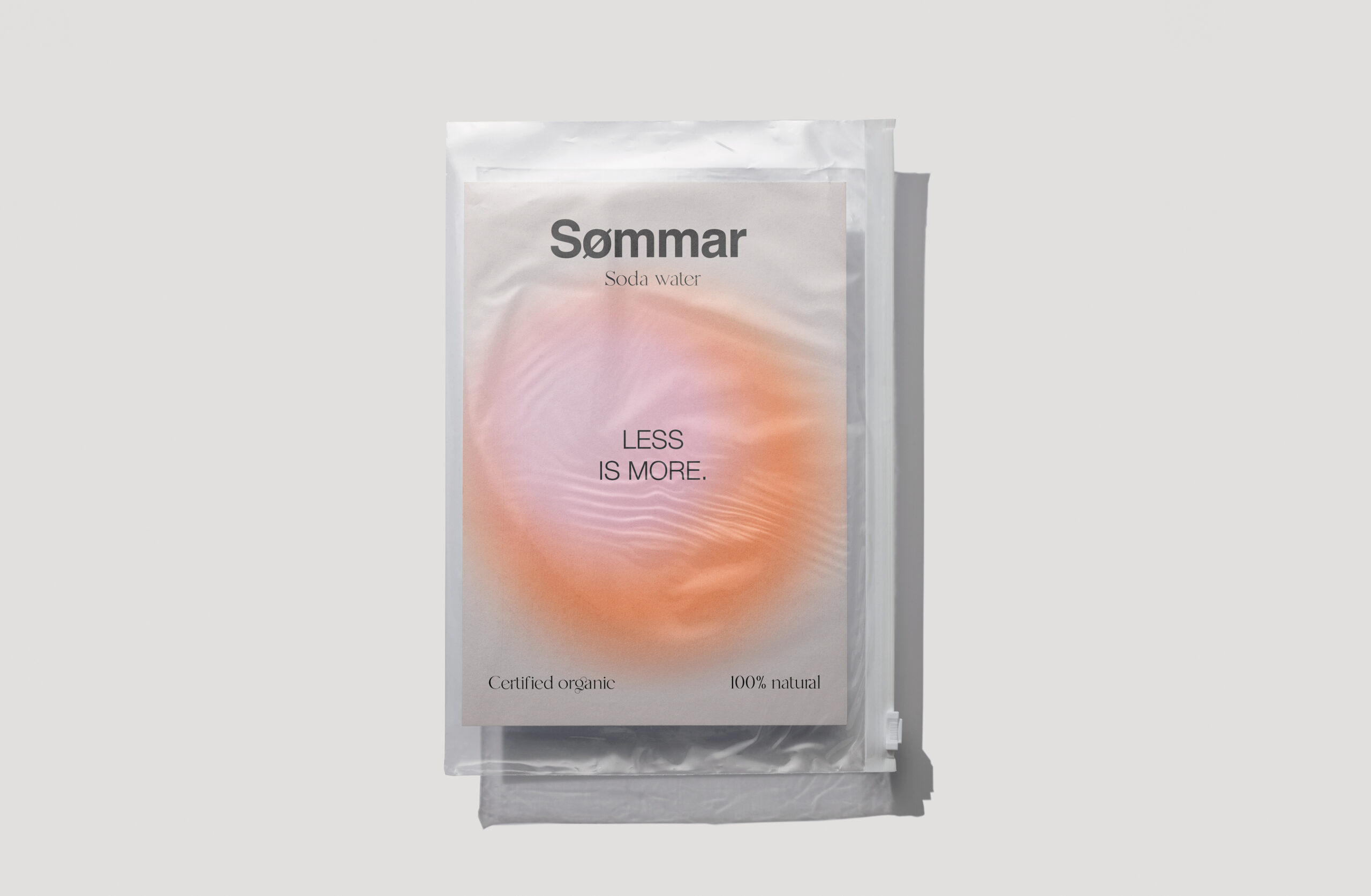
The name Sømmar, meaning summer in Swedish provided the inspiration for a brand identity centred around the feeling of a perfect Scandinavian summer: light, refreshing and effortlessly simple. Studio Nine developed a contemporary visual identity that reflects the brand’s natural positioning while giving it a distinctive presence in a competitive beverage market.
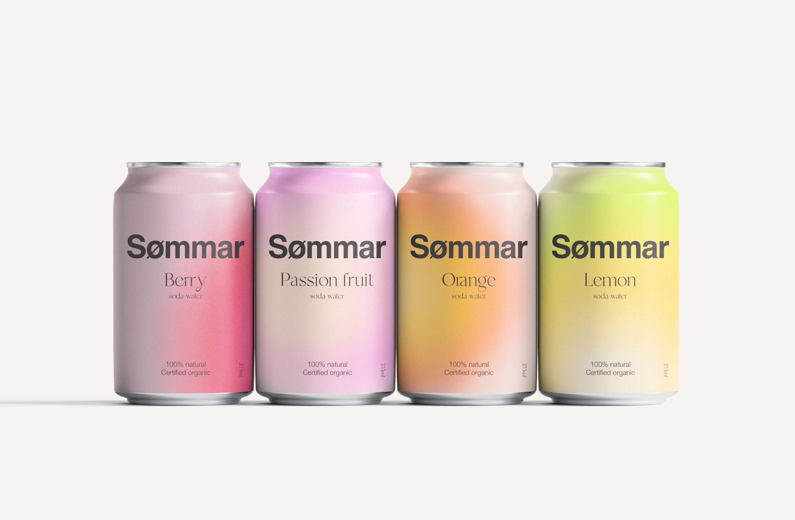
The brand identity design combines bold, minimal typography with a softer serif typeface and a fresh, expressive colour palette. Each flavour is given its own colour combination, creating clear differentiation across the range while maintaining a recognisable and cohesive visual system.
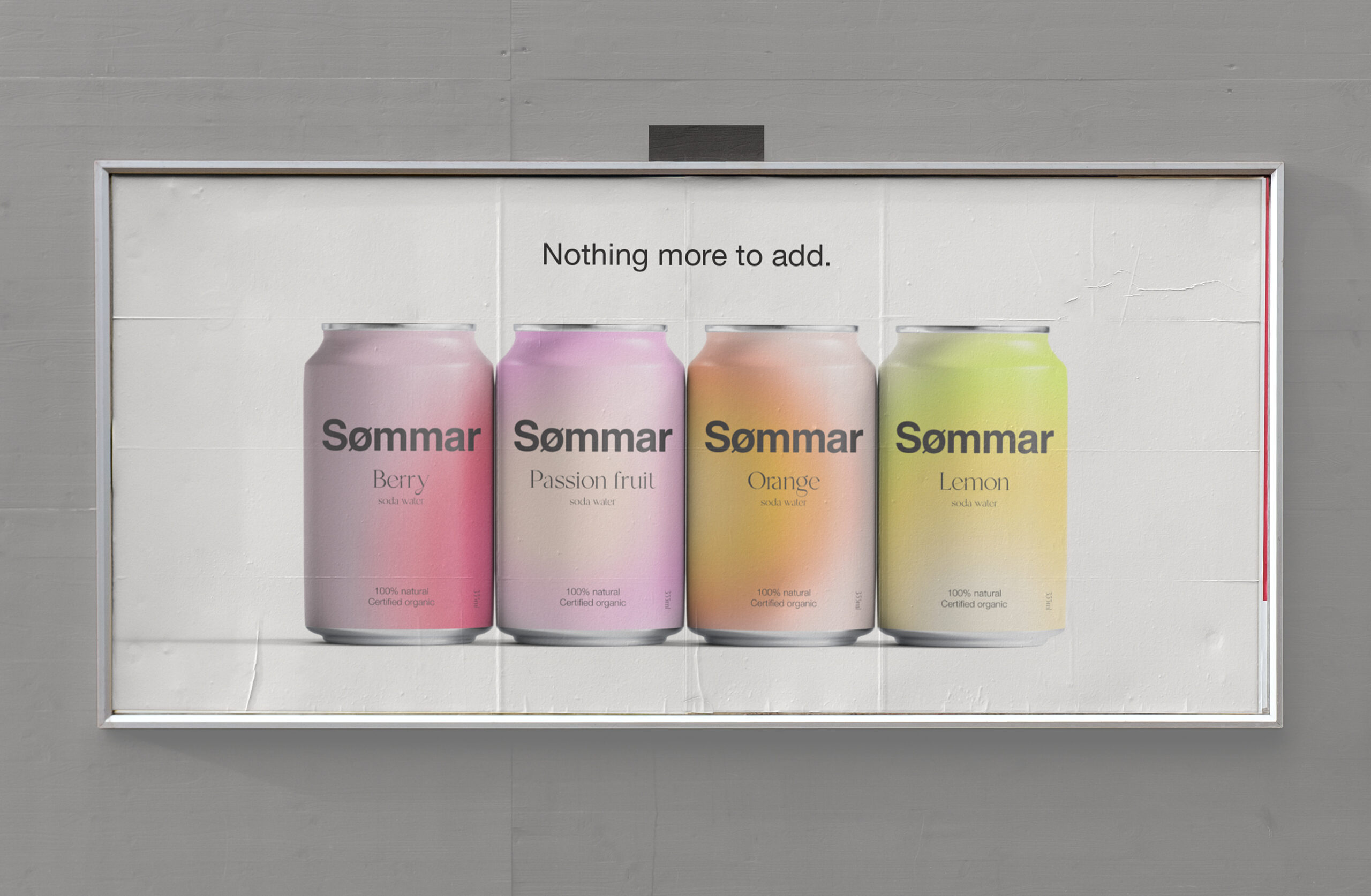
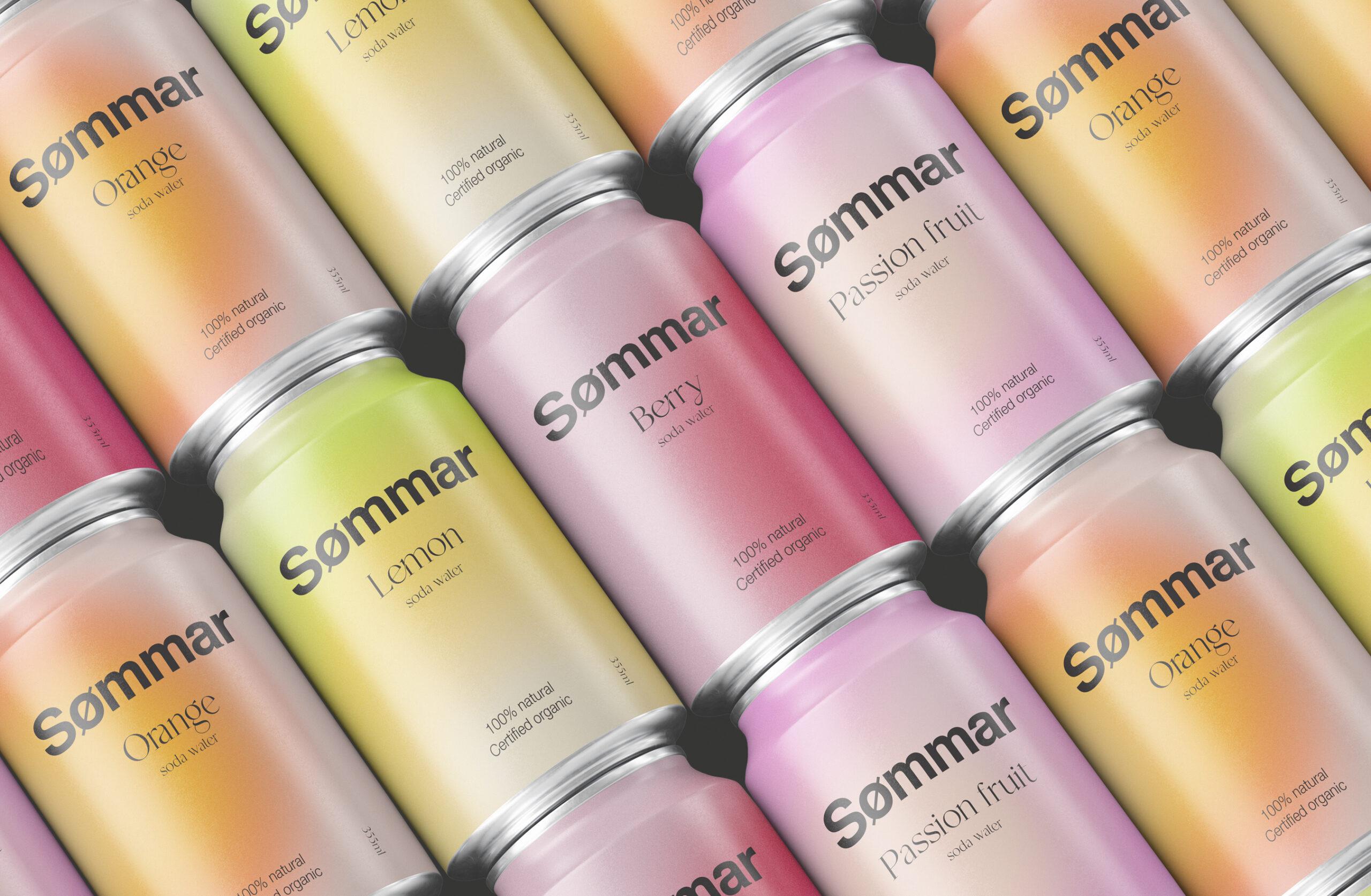
The identity was extended across packaging and graphic design, with the cans becoming one of the brand’s most important visual touchpoints. Soft gradients and vibrant colour pairings create shelf presence without compromising the minimalist aesthetic, while a considered typographic hierarchy communicates key product information clearly.
The resulting identity balances personality with simplicity — drawing on the Swedish philosophy of Lagom: not too much, not too little, but just the right amount.