Nuform Demolition is a next-generation demolition company founded in 2025 with a mission to challenge industry norms through efficiency, precision, and reliability. Built on a lean “in and out” model, the business focuses on delivering projects on time, on budget, and without the bureaucracy often associated with the sector.
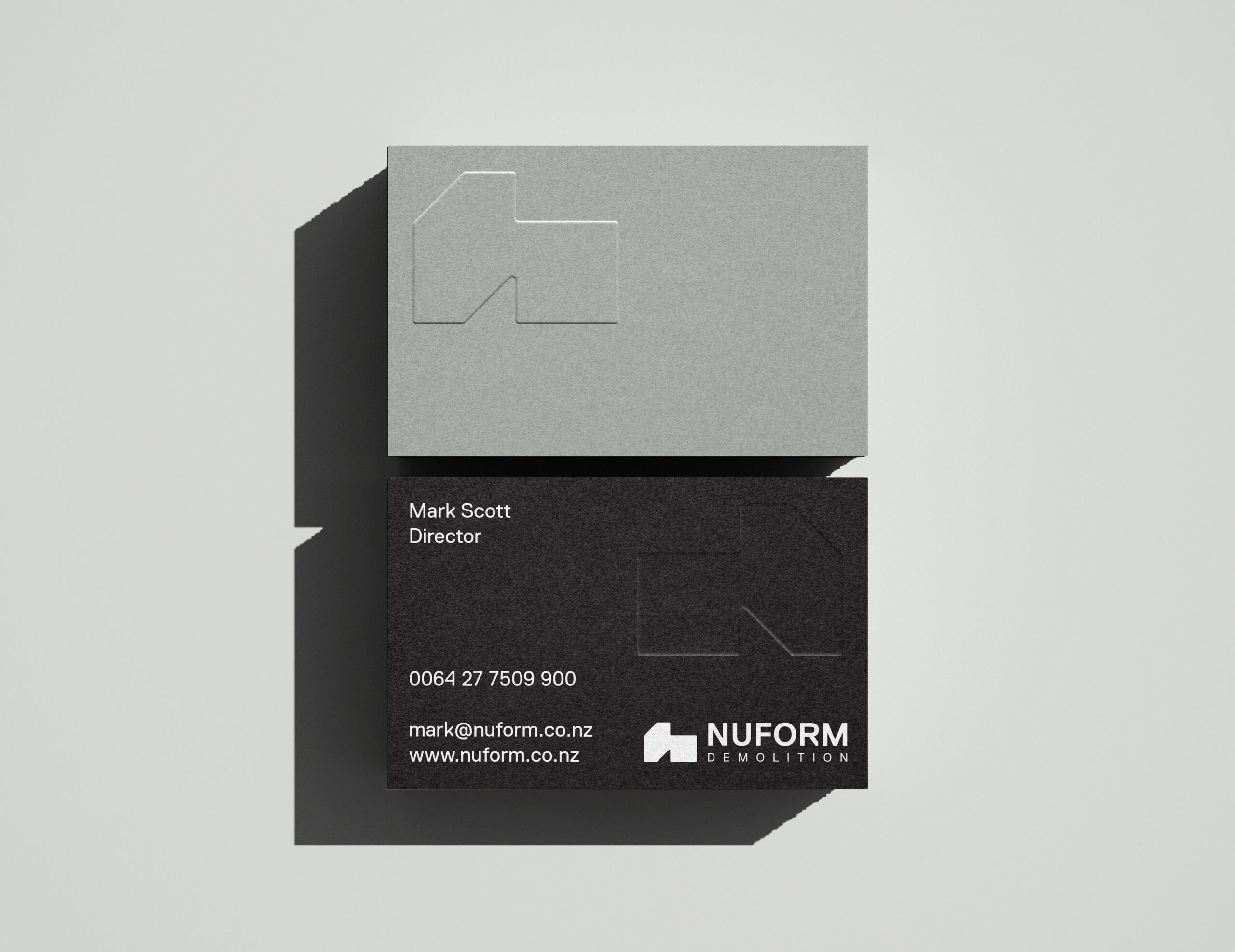
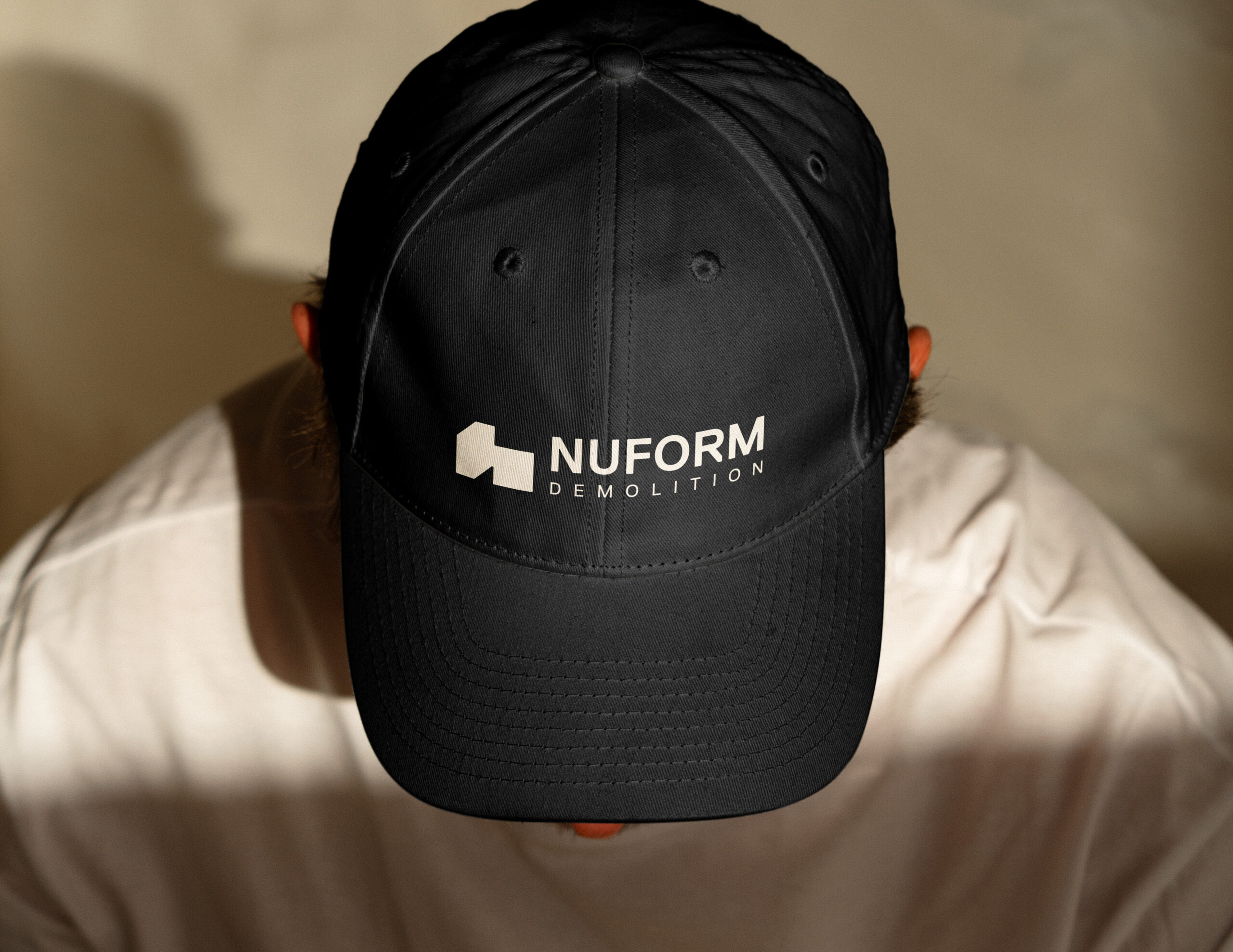
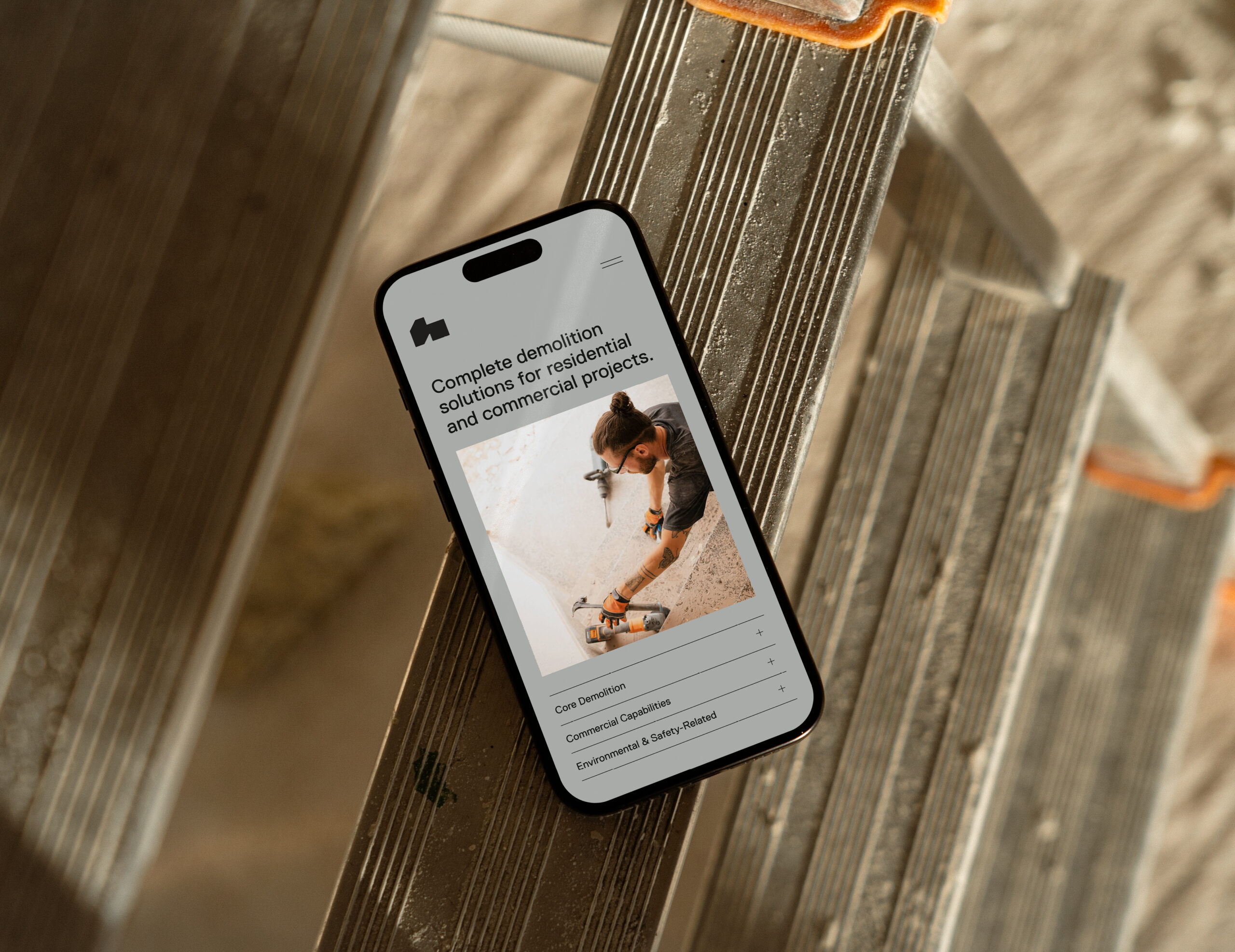
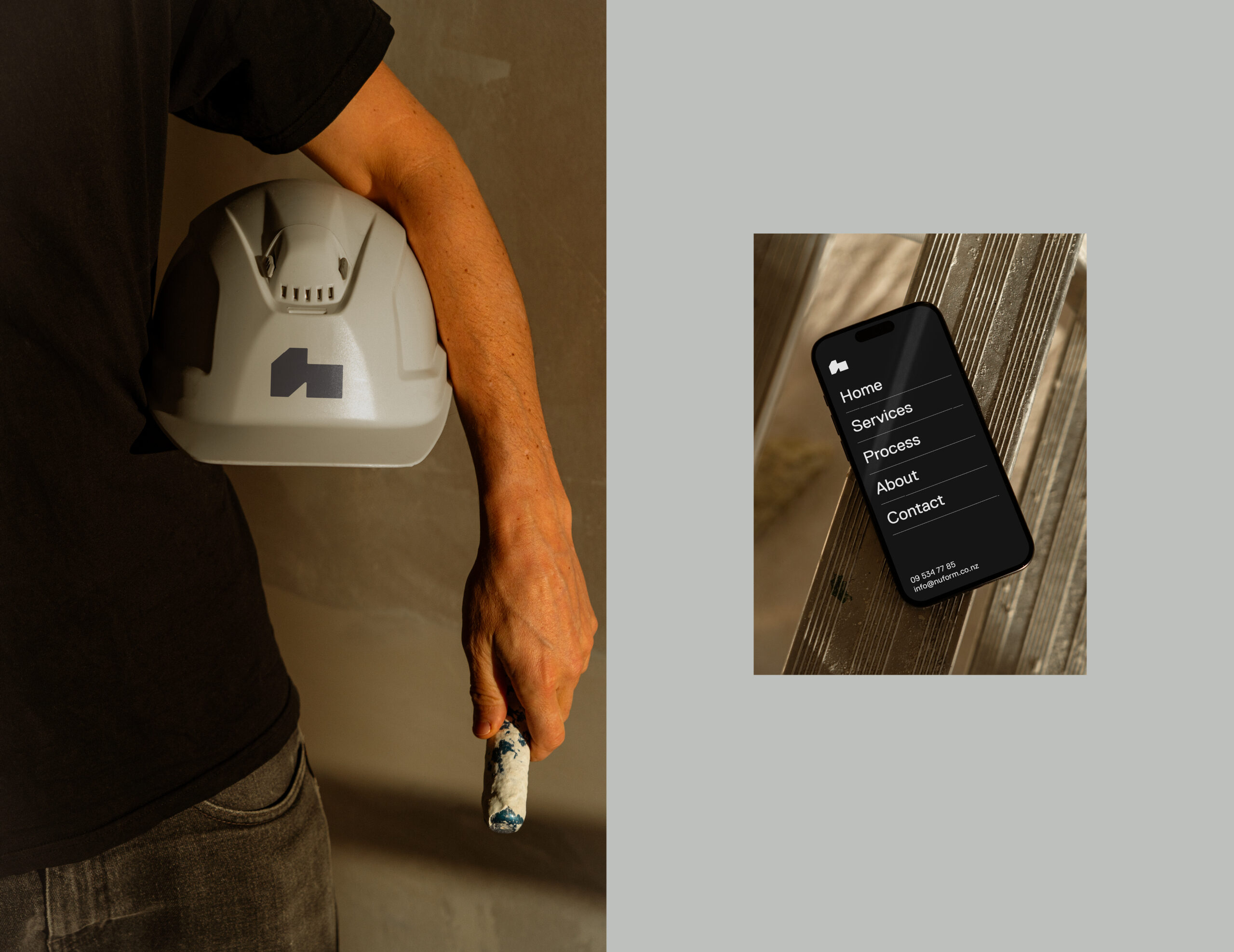
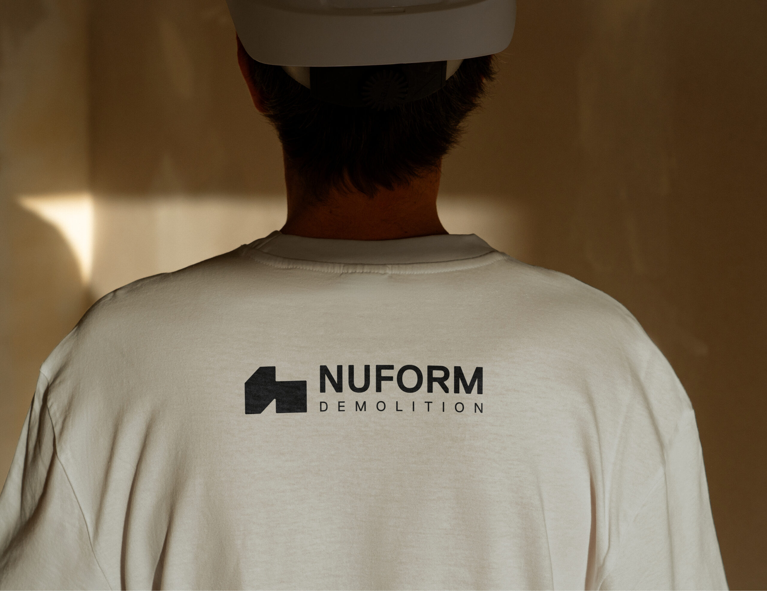
The brand identity needed to reflect this mindset: confident, modern, and professional, with enough attitude to stand apart in a traditionally conservative industry. The goal was to create a premium yet practical identity that would perform equally well across large-scale site signage, vehicle graphics, digital platforms, and marketing materials.
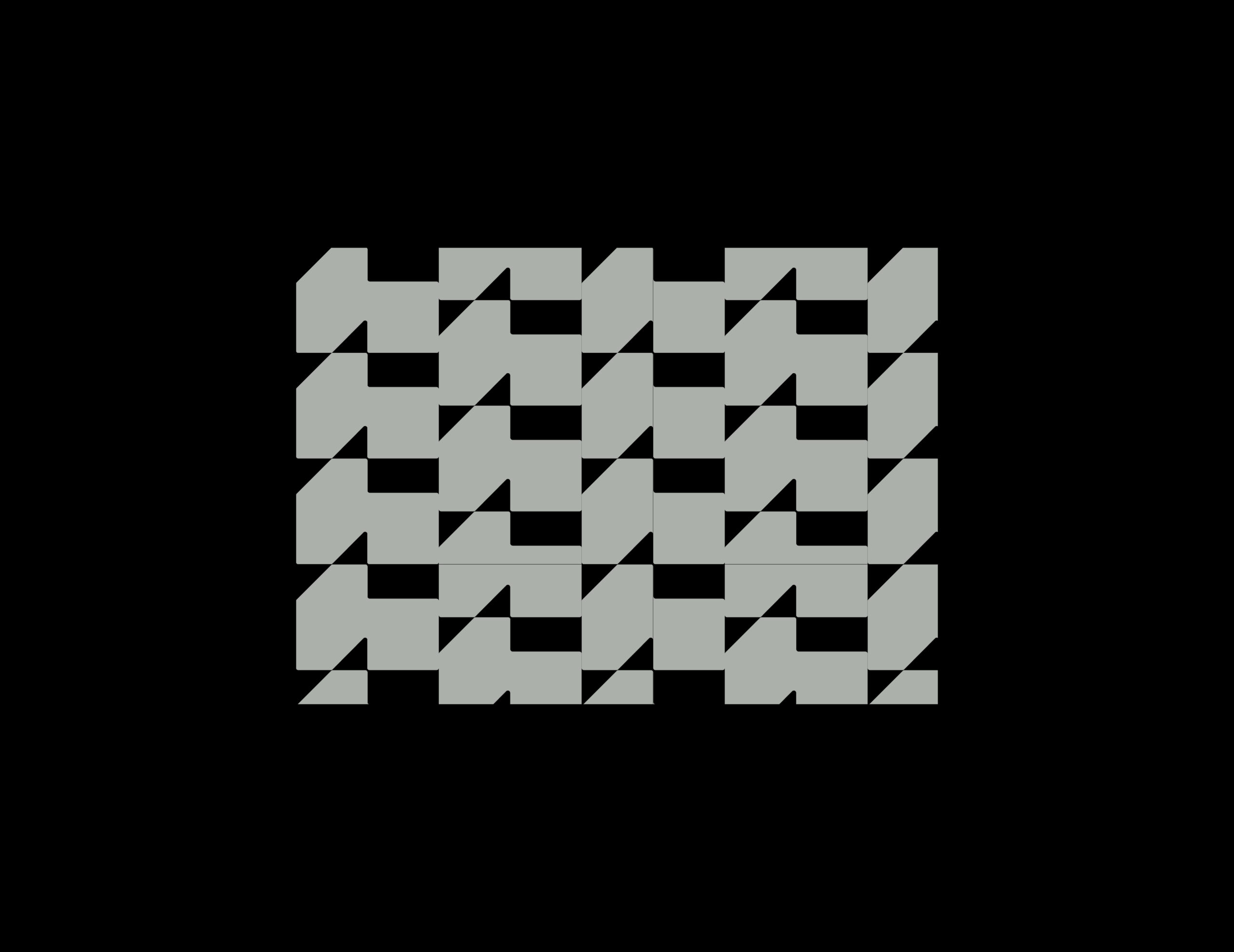
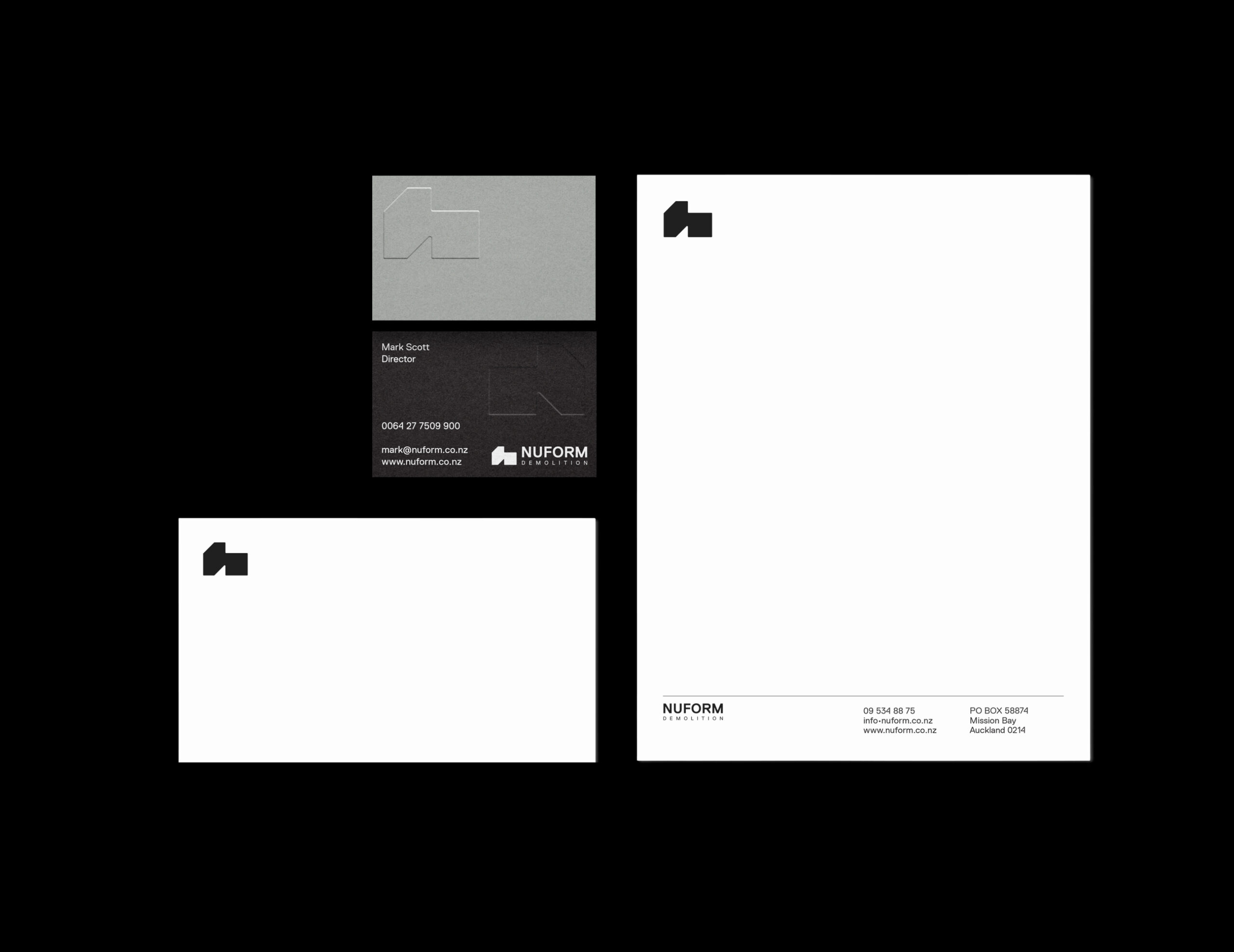
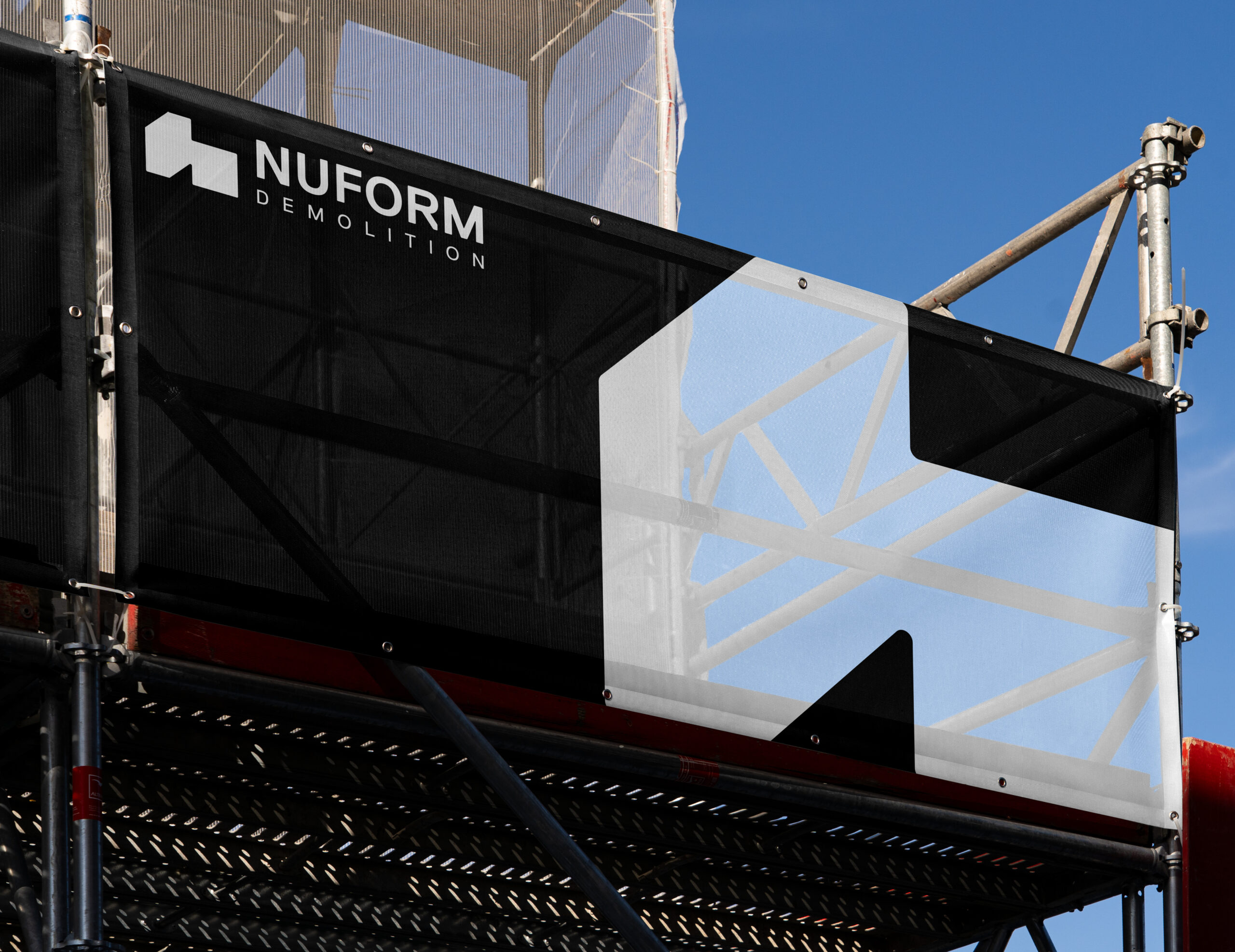
The logo combines a strong wordmark with a geometric icon designed to convey structure, transformation, and momentum. Its angular construction references architectural forms and demolition processes while maintaining a clean, recognisable silhouette. The result is a mark that feels bold and industrial, yet refined enough to communicate professionalism and trust.
Replica Pro was selected as the primary typeface for its clarity, balance, and contemporary neutrality. Its geometric precision reinforces the brand’s modern positioning while maintaining excellent legibility across both print and digital environments. The typography communicates confidence and reliability without unnecessary decoration, aligning with Nuform’s no-nonsense approach to business.
The colour palette centres around black, white, and concrete grey, reflecting the materials and environments associated with construction and demolition. The palette is deliberately minimal and high-contrast, allowing the brand to feel strong, professional, and highly visible in real-world applications such as machinery, site wraps, and vehicle signage.
Overall, the Nuform identity is bold, modern, and built for impact, a brand designed to stand out in a competitive industry while conveying strength, efficiency, and trust.