Insight – 21/01/2024
Some of the most acclaimed graphic designers of all time include Saul Bass, he was an American graphic designer and filmmaker, responsible for designing iconic movie posters and title sequences for movies such as Vertigo and Psycho. Another renowned designer is Paul Rand, an American graphic designer known for creating logos for major brands like IBM and ABC. Massimo Vignelli, an Italian designer who played a vital role in modern graphic design, was also known for his bold designs. David Carson, a designing trailblazer, was known for his unconventional approach to graphic design. Milton Glaser, an American graphic designer who designed the “I ❤ NY” logo and the Bob Dylan poster, is also a well-known name. These designers along with many others have had a considerable influence on graphic design, and their legacies continue to inspire designers across generations.
The path to success for these icons was inevitably paved with countless hours of practice and unwavering commitment to their craft. Persistence must be present to bring visuals to life, evoke emotions, and tell captivating stories.
Here are some invaluable ideas from some of the most accomplished graphic designers and the universal lessons they carry for all creatives. These principles should resonate deeply with any creative mind.
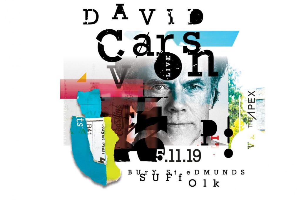
1. David Carson: Break rules but know your audience
David Carson is a graphic designer and art director known for his innovative typography and layout designs. He rose to prominence in the 1990s when he worked for magazine publications such as Ray Gun, Beach Culture, and Surfer. Carson’s influential design philosophy is centered on breaking the traditional rules of design and experimenting with unconventional approaches to create unique and visually engaging designs. His typography style often involves mixing different typefaces, overlapping text, and using non-linear layouts. He is considered one of the most important figures in contemporary graphic design, and his work has influenced countless designers around the world. Carson continues to design and teach design workshops, and in 2014 he was awarded the AIGA Medal, one of the highest honors in the design industry.
The Grunge style is known as a design movement that doesn’t respect any rule of composition. Even Carson admits that his design is experimental, personal and intuitive and it has nothing to do with formal design. But if you look closely at Grunge posters you’ll notice some rules of composition and proportion. There is a visible contrast and proportional ratio between elements, type and background.
Another important lesson to learn from Carson is to know the audience you are designing for. His different backgrounds played an important role in his career. Being a professional surfer himself, he knew the culture of the target audiences of magazines and companies such as Beach Culture and Quicksilver. He understood the needs of the young people who love extreme sports, and he knew how to address them.
When David Carson had to design a layout for a magazine, he first read the article and then tried to visually reproduce the message and recreate the concept. Working at the Ray Gun was a period of visual experimentation, without any rules. He says that he didn’t have to follow any layout or grid guidelines. The designers just let the music communicate the direction of how the magazine looked.
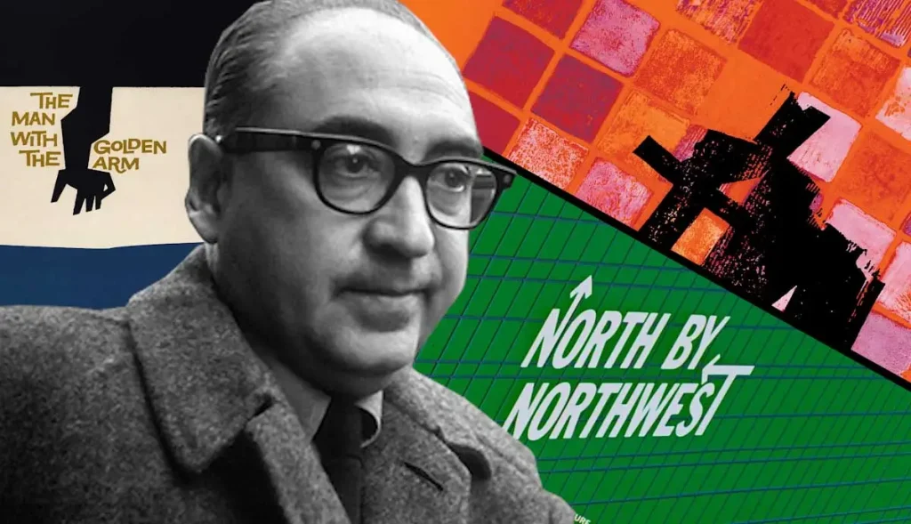
2. Saul Bass: Keep it simple
Saul Bass might be the single most accomplished graphic designer in history. Working in the mid 20th century, when the importance of graphic design was just on the upswing, Bass branded a staggering array of major corporations with his iconic, minimal designs.
Saul Bass was an American graphic designer as well as a filmmaker known for his iconic movie title sequences and corporate logos. Born in the Bronx in 1920, Bass started his career in advertising before branching out into film design. He is widely credited with revolutionizing the art of film titles, creating dynamic and visually striking sequences for classics such as Hitchcock’s Vertigo and Anatomy of a Murder. Bass also designed corporate logos for major companies such as AT&T, Quaker Oats, and United Airlines, among others. His bold, minimalist style and innovative use of typography made him one of the most influential designers of the 20th century. He passed away in 1996 at the age of 75, leaving behind a legacy of timeless and impactful design work.
“Symbolise and summarise” was the motto Bass lived by when it came to design, and his careful choice of bold colours and shapes was an important part of this. His minimal simplicity would become his trademark allowing for legibility and readability in his designs; you really want to look at them!
Simplicity is perhaps the most crucial lesson that other graphic designers can learn from him. Simplicity does not mean uninteresting; it means stripping away the unnecessary and focusing on what is essential. In a world where people are bombarded with information all the time, it is more important than ever to keep designs simple and intuitive for users.
Simplifying your design can improve user experience. A clean and simple design can help users navigate through the messaging with ease and find the information they need quickly. When designing a website or any print collateral, focus on the core message or goal and eliminate any elements that do not support that goal.
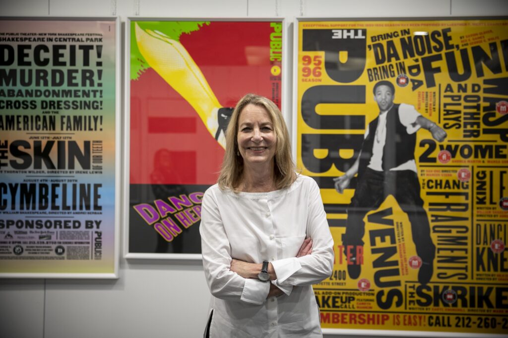
3. Paula Scher: Belive in yourself
Paula Scher is an accomplished graphic designer and artist known for her illustrious career spanning over four decades. She began her career as a production designer for CBS records before transitioning to graphic design in the late 1970s. Since then, she has established herself as a leading figure in the field and has won numerous accolades for her work. Scher is renowned for her iconic logos for companies such as Citibank, Microsoft, and Tiffany & Co. Additionally, she has worked on album covers, book jackets, advertisements, and branding campaigns for a wide range of clients. Scher is a partner at Pentagram, a world-renowned design consultancy, and has been recognized for her contributions with the prestigious AIGA medal and induction into the Art Directors Club hall of fame. She continues to inspire and mentor young designers with her innovative approach to design and her insightful teachings.
She has worked relentlessly to revolutionize the graphic designing industry with her overzealous determination and creative work for over four decades. Her unabashed and iconic images found their way into American vernacular. Besides this, she is also a painter and an art educator, who became the first female to be offered the principal position at Pentagram in 1990s.
At an early age Paula began drawing as an escape. Teachers told her she had no promise or talent. Her parents told her there was no future in the arts. Yet Paula Scher rose to the challenge and became one of today’s most iconic designers.
One of the many things that makes Scher’s career so impressive is that she found success at a time when branding and design was still very much a male-dominated sector, and it was almost unheard of for a woman to occupy a leading role. Luckily, she was able to find female inspiration by looking further afield, particularly to fashion publications. “I realized a woman could have a head job, she didn’t always have to be an assistant”, says Scher, of the female art directors and editors who inspired her at the time. In 1991, she took on the role of Principal at Pentagram, the world’s largest independent design consultancy, making her the first ever woman to do so. “Joining Pentagram equalized me”, she muses, “so that the idea of a woman handling a major corporate account seemed less bizarre”.
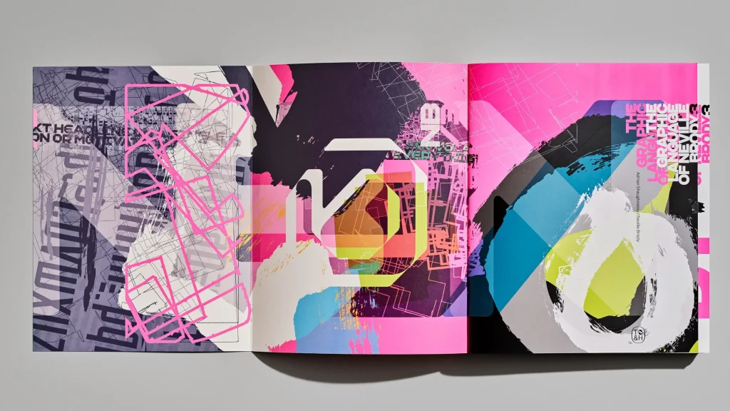
4. Neville Brody: Experiment with type
Neville Brody is a renowned British graphic designer, typographer, and art director who was born in 1957. He is best known for his innovative and experimental design style, which helped to redefine the graphic design industry in the 1980s and 1990s. He has worked for several famous publications and brands such as The Face, Arena, Raygun, and Nike. His contributions to the field of graphic design include the creation of several typefaces, including the Blur and FF World typefaces. Brody is also a prominent educator and has taught at various universities around the world, including the Royal College of Art, where he served as the head of the Department of Graphic Design from 2011 to 2014. Overall, Neville Brody is an influential figure in the world of graphic design, and his work continues to inspire designers around the globe.
Brody’s 1988 Nike advertisement “Just Bounce It”, practiced new forms and methods of experimental typography, incorporating image with dramatically varied scales of lettering. This new typographic approach invigorated the audience to develop into active viewers. By presenting a new technique within a popular context such as Nike, Brody challenged design conventions for an entire generation of artists and the general public. He encouraged them to reject the conventions of traditional typography and accept a new form of experimental type and image making.
It’s important to consider whether these styles are appropriate for your audience or publication, the value of readability versus artistic value, and the overall relationship to your brand as a whole. Test fonts, pay attention to analytics, and poll your audience. Do they understand what you are trying to communicate? Watch for red flags in your analytics such as drops in traffic, reduced time on site/page, and unclicked calls-to-action.
Pair an experimental typeface with a simpler, more legible font that reiterates key messaging.
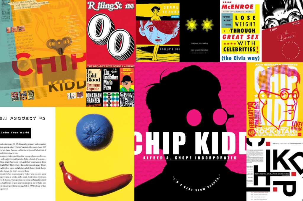
5. Chip Kid: Master visual language
Chip Kidd is an American graphic designer best known for his book cover designs. He was born on September 12, 1964, in Reading, Pennsylvania, USA. After graduating from Penn State in 1986, he began working at Knopf publishing house in New York City, where he has been credited with revolutionizing book cover design. Kidd has designed more than 1,500 book covers, including best-sellers such as Michael Crichton’s Jurassic Park and Cormac McCarthy’s The Road. He has won numerous awards for his work, including multiple National Design awards from the Cooper-Hewitt Smithsonian Design Museum. Kidd is also an author and editor of several books, including The Cheese Monkeys and Batman: Death by Design. He is recognized as one of the most influential designers of our time.
Chip Kidd is a contemporary designer specializing in book jacket designs whose work has been described by NPR as having “spawned a revolution in the art of American book packaging”. Chip Kidd’s unique approach to book cover design consists of working to embody the book’s narrative in a visual way, through visual language. It’s this radical way of thinking about design that sets him apart from the rest, and keeps his designs memorable, timeless and a credit to the design community.
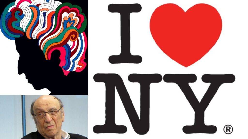
6. Milton Glaser: Trust your instincts
Milton Glaser (1929-2020) was an American graphic designer widely known for his work in the field. He was the co-founder of Push Pin Studios and New York Magazine, and designed the iconic “I ♥ NY” logo. Glaser’s work is characterized by its simplicity, wit, and colorful designs. He worked on a variety of projects, including branding, advertising, book design, and poster design. Glaser also taught graphic design at the School of Visual Arts in New York and received numerous awards and recognitions throughout his career. His impact on the design world is still felt today, and his legacy serves as an inspiration to many graphic designers around the world.
Hi famous “I ♥ NY” logo was created as part of a campaign to promote tourism in New York City, which was struggling economically at the time. Glaser came up with the design in a taxi cab, using red crayon and scrap paper. The logo features a simple, powerful message of love for the city, with a heart symbol replacing the word “love.” The font used for “NY” is called American Typewriter Bold. Since its creation, the logo has become a cultural symbol of New York City, appearing on countless souvenirs, t-shirts, and advertisements. Despite its popularity, Glaser chose not to trademark the logo, believing that it should belong to the public.
Decades after his initial rendering of I♥NY, Milton Glaser admitted it took him about 10 seconds. He claimed his inspiration came from memories of romantic carvings in tree trunks, where lovers mark their initials and usually connect them with a heart pierced by an arrow. This sense of serendipity and trusting the moment is repetitive throughout Glaser’s career, also coming to life in his posters. When referring to his 1960s monoprint work, Glaser stated that “works that are too preconceived tend to go dead. To become inert”
Say Hello!
Studio Nine
33-45 Hurstmere Rd
North Shore, Takapuna
M. +64 21 1306 713
katrina@studionine.co.nz
© Studio Nine
Branding & Graphic Design NZ