Insight – 010/09/2023
Colour plays an important role in how your brand is perceived. Colour has psychological connections to human emotions, and this connection can influence marketing. Using the right colours in your marketing campaigns can trigger certain emotions for customers, leading them to make a purchase or learn more about your product.
Colour psychology is the study of colours in relation to human behavior. It aims to determine how colour affects our day to day decisions such as the items we buy. Does the colour of a dress compel us into purchase? Do the colours of a package make us choose one brand over another? Does the colour of an icon make us more likely to click on it? The short answer is yes. But the why part is a bit more complicated. Colour meanings can have an impact on why we prefer certain colors over others. The same color can also have different meanings that are dependent on our upbringing, gender, location, values, and a variety of other factors.
Red
Red is a powerful color that can evoke a range of emotions and associations, from passion and excitement to danger and warning. As such, many companies and organizations use red in their branding to convey a particular message or image. For example, Coca-Cola has made red a cornerstone of its brand identity, associating the color with happiness, celebration, and refreshment. Meanwhile, some financial institutions use red to convey strength and stability, while others use it to indicate urgency or caution. Red is also a popular choice for sports teams, signaling energy, determination, and sometimes aggression. When used effectively, red can be a powerful tool for building recognition and attracting customers or fans to a brand.
It is often associated with passion, love, and energy. However, it can also represent anger, danger and warning. This complex range of emotions makes red an attention-grabbing color that can be used to create a sense of urgency, excitement or romance.
In marketing, red is often used to stimulate appetite and create a sense of urgency. It is commonly seen in advertising for food, sales, and promotions. It can also represent danger, which explains why it is commonly seen on warning signs and labels.
In summary, red is a complex color that can evoke a range of emotions. It is a powerful tool in marketing, fashion, and design, and should be used carefully to ensure it elicits the intended response.
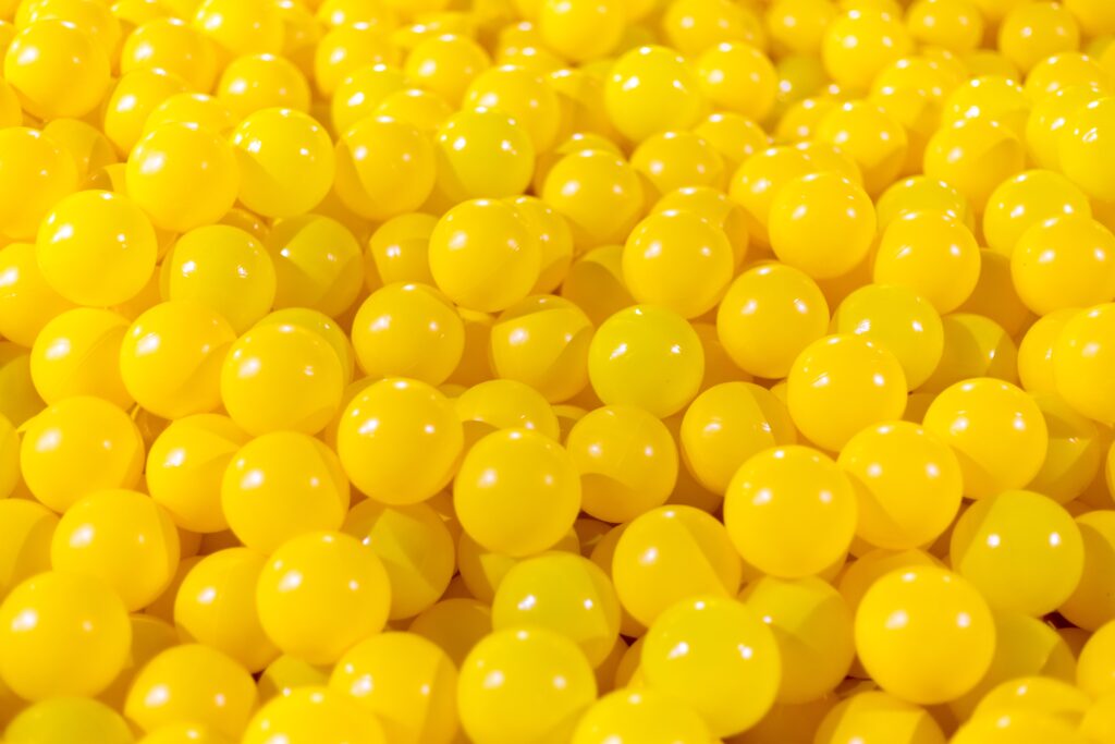
Yellow
Yellow is a bright and attention-grabbing color that can convey multiple emotions and messages. In branding, yellow is often used to evoke feelings of optimism, happiness, and positivity. Brands that use yellow often aim to create an energetic, youthful, and fun personality that resonates with their target audience. Yellow can also represent creativity, intelligence, and curiosity, making it ideal for brands in industries such as technology, education, and entertainment. However, it’s important to note that yellow can also have negative connotations such as caution or cowardice. Brands should be mindful of these potential associations and consider using yellow in combination with other colors to create a balanced and effective branding strategy.
In psychology, the colour yellow is associated with positive emotions such as happiness, optimism, and friendliness. It is commonly used in marketing as it is believed to stimulate the brain and increase mental agility. However, too much yellow can also create feelings of anxiety, frustration, and agitation. Some studies suggest that the colour yellow can help enhance cognitive abilities and improve memory retention. In addition, yellow is often used in interior design to create warm and welcoming spaces. It is considered a cheerful and uplifting colour that can boost self-esteem and promote creativity. In summary, the colour yellow has a positive impact on our emotions and has a wide range of psychological and practical applications.
Green
Green is a versatile color that can be used in branding to convey a variety of messages and emotions. Depending on the shade and context, green can suggest growth, nature, calmness, health, and environmental awareness.
This makes green an ideal choice for brands that want to communicate values like sustainability, freshness, or renewal. For example, food and beverage companies could use a bright, grassy green to highlight their natural ingredients, while financial institutions may choose a deeper, more corporate green to evoke stability and reliability.
Green is also a popular color for eco-friendly and socially responsible brands that want to appeal to environmentally-conscious consumers. By using green in their logo and marketing materials, these companies can signal their commitment to sustainability and reflect their values in a memorable way.
Overall, green is a powerful tool in branding that can convey a range of meanings, depending on the context and target audience.
Blue
The use of blue color in branding is quite common across industries. Blue is often associated with traits like competence, trust, reliability, and professionalism. It is a cool and calming color that is believed to inspire feelings of security and even spirituality. Many big brands like IBM, HP, Dell, and Ford have blue color in their branding.
Blue color is also linked to water and the sky, which represents stability, loyalty, and dependability. In recent times, blue has also been used to convey a sense of technology and innovation, as seen in brands like Facebook, Twitter, and LinkedIn.
With its universal appeal, blue color is used extensively in branding, from financial institutions to tech companies to businesses that sell a variety of products. It is a versatile and widely accepted color, making it an excellent choice for brands seeking credibility and trustworthiness.
The colour blue is often associated with feelings of calmness, peace, and relaxation. It is said to have a soothing effect on the mind and body, and is often used in places where a peaceful and serene atmosphere is desired, like hospitals, offices, and bedrooms. Blue is also associated with intelligence, wisdom and trustworthiness, which is why many financial and technological brands often use it in their logos and marketing materials. However, too much blue can create feelings of sadness and depression – which is why it’s important to use it in moderation, and to combine it with other colours to create a balanced and harmonious aesthetic in any setting. Overall, the psychology of the colour blue is complex and nuanced, but it has been shown to have a positive impact on mental and emotional wellbeing for many people.

Purple
Purple is a powerful color that is commonly used in branding because it has a wide range of meanings and associations. It is often associated with luxury, sophistication and creativity. Purple is also frequently used to represent spirituality and royalty, as well as individuality and uniqueness. From light lilacs to deep burgundies, the different shades of purple offer unique emotional effects. Scientifically, Purple is made by mixing blue and red which consequently portrays trust and stability together with passion and energy. Brands such as Hallmark, Cadbury, Yahoo and Uber, all incorporate the color purple in their logo designs because it helps them create a captivating brand image that catches attention and stands out from the competition. Overall, when used correctly, purple can be an excellent tool for creating a lasting and memorable brand identity, all while conveying a sense of luxury, creativity, and individuality.
Purple is often associated with royalty, luxury, prestige, and power. This can be traced back to ancient times when purple dye was very expensive and only used by the elite class. The colour has also been linked to spirituality, creativity, and imagination. This is likely due to its association with the crown chakra, which is believed to be located at the top of the head and associated with spiritual enlightenment. In terms of emotions, purple is said to evoke feelings of mystery, wisdom, and sophistication. It is also considered a calming and comforting colour, often used to promote relaxation and restful sleep. However, too much purple can be overwhelming or even depressing, so it is recommended to use it sparingly. Overall, purple is a versatile colour associated with a wide range of positive qualities.
Orange
The use of orange in branding can convey energy, enthusiasm, warmth, and friendliness. It is often associated with feelings of excitement and fun. Moreover, orange is frequently connected to healthy lifestyles due to its connection to the fruit. The color has also been used by brands to denote affordability and value, as well as creativity and innovation. It has been used by brands in the tech, fast-food restaurant, and sports industries. Lastly, orange can be combined with other colors to convey different meanings. For example, when combined with blue, it can represent trust and reliability while also evoking a feeling of innovation and uniqueness. In a nutshell, orange can help brands to communicate a variety of messages to their customers, depending on the context and the combination of colors used.
The color orange is a warm and energetic color that is associated with enthusiasm, creativity, and emotional expression. As an attention-grabbing color, it is often used to stimulate creativity and can evoke feelings of excitement and passion. Orange is also associated with wellness and balance, making it a popular choice for branding in the health and fitness industry.
In color psychology, orange is believed to have a positive impact on mood and emotional health by boosting emotional energy, promoting confidence and self-assurance, and helping to combat lethargy and depression. It is often used in color therapy and meditation to promote feelings of joy, happiness, and success.
However, excessive use of orange can create feelings of restlessness and impatience, so it is best used in moderation. In design, it is often paired with cooler colors such as blue or green to create a balanced, harmonious effect.
Teal
Teal is a popular color in branding because of its associations with trust, communication, and sophistication. As a blended mixture of blue and green, it evokes the calm and reliability of blue, with the growth and vibrancy of green. Teal is also a versatile color, pairing well with a variety of other hues, making it a popular choice for many different industries.
In branding, teal can be used to communicate a company’s commitment to customer service, transparency, and fairness. It is often used by technology companies and financial institutions, as well as healthcare and wellness brands. Teal can also be used as an accent color to add a pop of visual interest to a brand’s visual identity.
Overall, teal is an excellent choice for brands that want to convey trust, professionalism, and credibility, while also adding a touch of personality and modernity.

Say Hello!
Studio Nine
33-45 Hurstmere Rd
North Shore, Takapuna
M. +64 21 1306 713
katrina@studionine.co.nz
© Studio Nine
Branding & Graphic Design NZ