Logo design Brand identity design Collateral design
Aspire Property Management provide high-level property management services to both residential and commercial properties. They approached Studio Nine as they wanted to refresh their logo and visual brand identity which was dated and didn’t fit the company’s values.
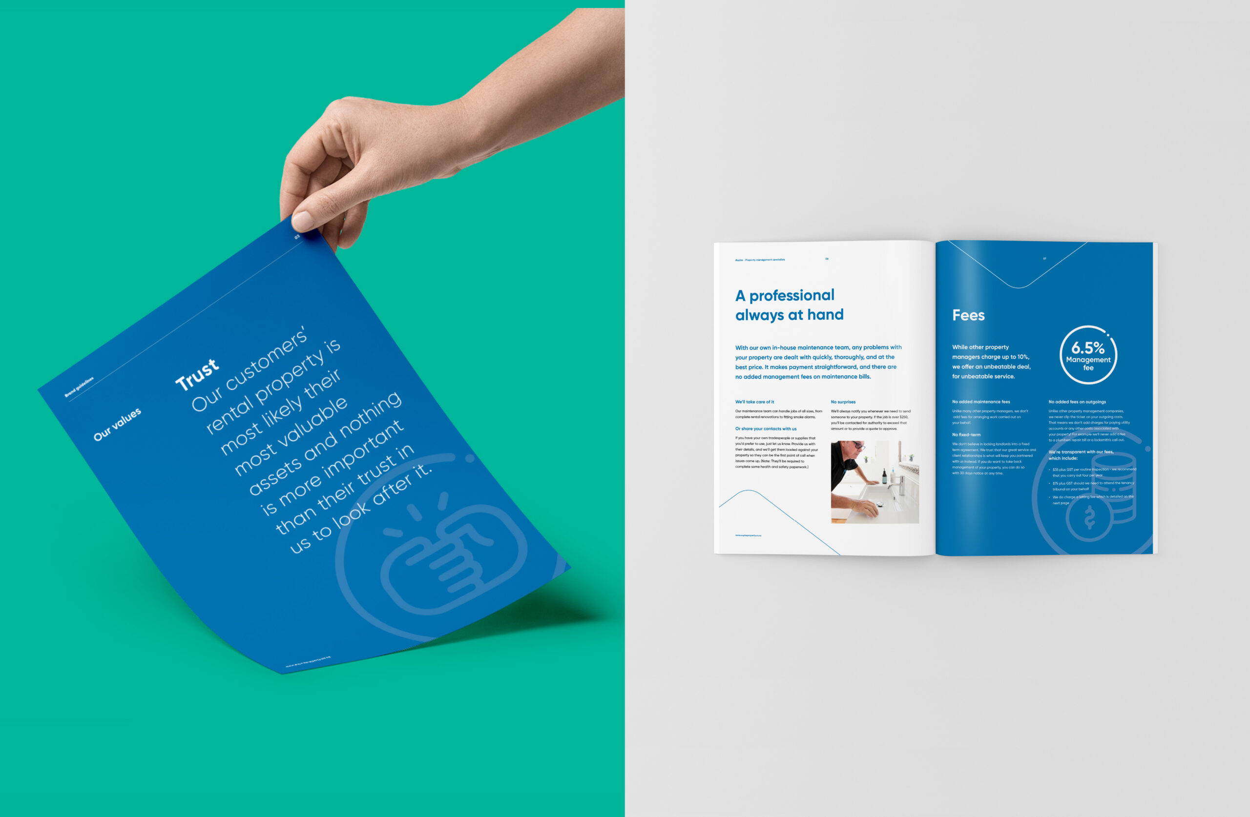
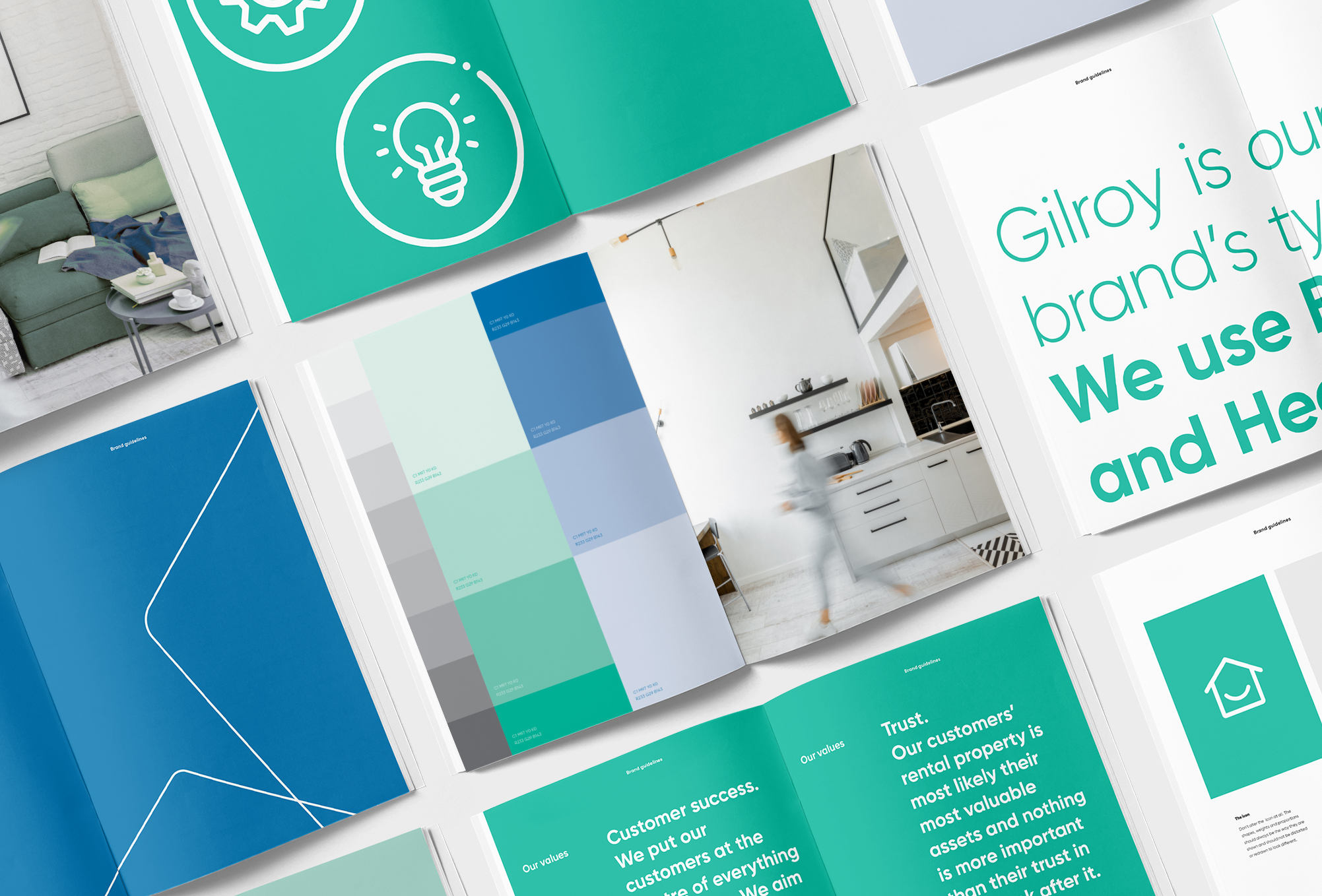
Aspire Property’s new brand identity is all about articulating the teams’ trustworthy, likeable and professional approach. Nothing is more important to them than their clients’ trust in them to look after their rental property.
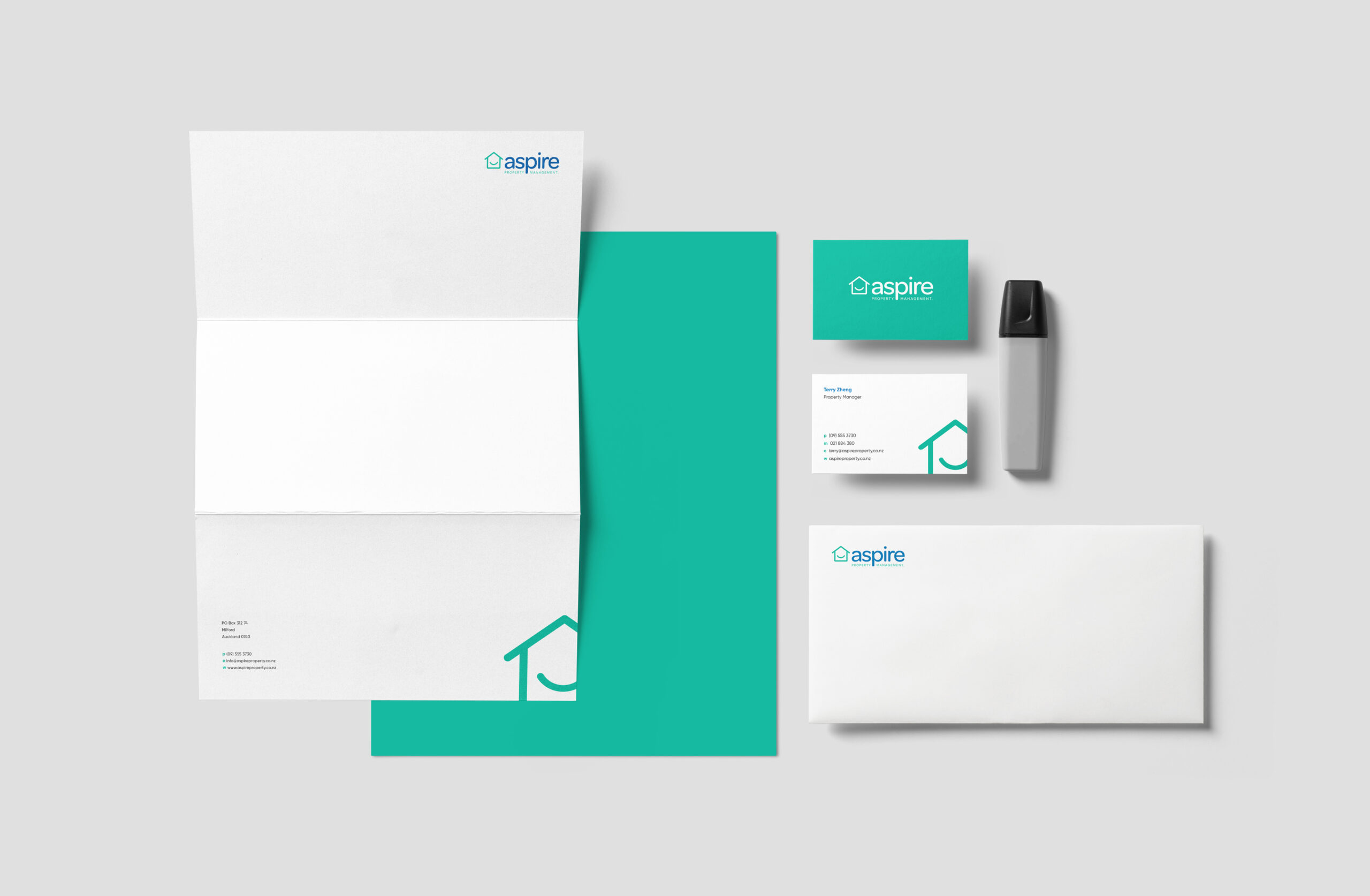
We have updated their identity / graphic design with lively colour palette, simple and modern typography rolling it out across print collateral, stationery and signage. We have selected teal as the primary colour. It has positive associations: feelings of friendliness and happiness. Teal is a balanced colour that carries a feeling of stability and harmony. Our second choice for their primary colour was a medium toned blue to highlight their professionalism and trustworthiness.