Insight – 08/04/2023
Whether you’re a designer, freelancer, or a business owner, creating a solid and recognisable brand identity is essential for standing out in your industry. Done right, branding can make a great first impression, keep your business front of mind, and attract potential customers.
Brand identity design is constantly evolving and adapting to the changing times. As we enter 2023, new trends are emerging that will shape the way we approach content design and visual communication.

1. Adaptive logo design
Many brand designers and agencies are now evolving their mindsets on producing fixed logos. Adaptive logos, a term used to describe logos that are designed to have more than one iteration, are becoming an increasing tendency in logo design.
With screens now coming in a variety of shapes and sizes, simply scaling down a logo just doesn’t work with most logos. Instead, perhaps what’s required is a suite of logos which adapt and suit any device shape.
An adaptive logo is designed responsively. It alters depending on the platform being used. If you look at a website on your computer and compare it to the same site on your cell phone, the format should change for ease of use.
An adaptive logo is consistent. Regardless of the variation, it will still need to be recognisable.
Adaptive logos also refer to logos which cycle, or rotate. The basic elements will stay the same, rendering it easy to recognise, but some parts may change, such as the colour or the background.
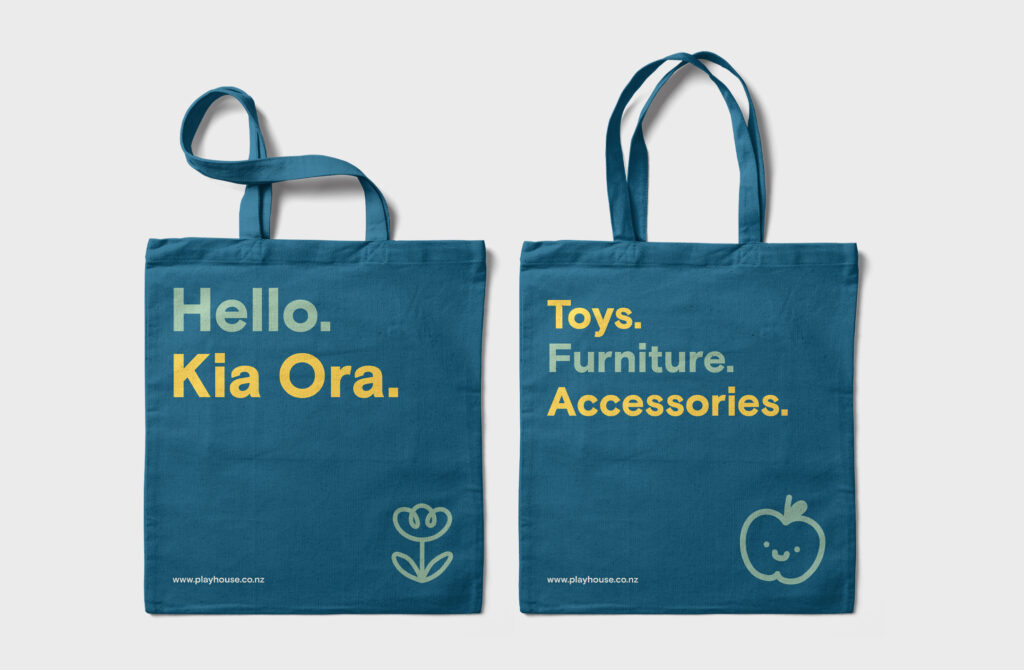
2. Bright and playful colour palettes
Colour is an incredibly important design tool. It’s instrumental in evoking emotion, influencing behaviour, conveying tone, defining style, and much more. However colour trends come and go, designers are being presented with an exciting new selection of colour trends to experiment with in 2023.
The use of bright, playful colour palettes is becoming an increasingly popular trend in graphic design. This trend is characterised by the use of pastel colours, neon hues, and bold, bright shades. In 2023, expect to see brand designers incorporating these colour palettes into their work in new and creative ways. This trend is particularly popular in packaging design, where it can be used to create designs that are playful, fun, and appealing.

3. Sustainability
In the age of sustainability and eco-conscious consumers, companies and brands are aiming to reduce their carbon footprints and become active stewards for socially responsible corporate programs.
A sustainable brand is one that has successfully integrated environmental, economic and social issues into its business operations. More companies are addressing social issues in their environmental sustainability programs as they realise how interlocked the two are. how much attention companies are putting toward their sustainability strategies. Examples of sustainability initiatives include:
Customers are becoming more risk-averse when it comes to spending their money. They generally spend more carefully than previous generations. However, when they do spend, there are some emerging patterns that favour sustainable brands. These consumers prefer to spend their money on brands that preach pro-social messages, apply sustainable manufacturing practices and exercise ethical business standards.
It’s clear that consumers prefer sustainable brands. But without proper messaging to reach your consumers and show them what your brand is doing, they will end up buying from your competitors. Pay special attention to what you send out in press releases and on social media, as well as the general brand perception of your company, to ensure that you are showing consumers what you stand for.
Consumers want to buy from brands whose packaging is made of recyclable materials and kept to its minimum. Moreover, rarely ever there is any physical correspondence to avoid using too much paper. All of this has a direct influence on the customers’ perception of the brand.
4. Line art illustrations
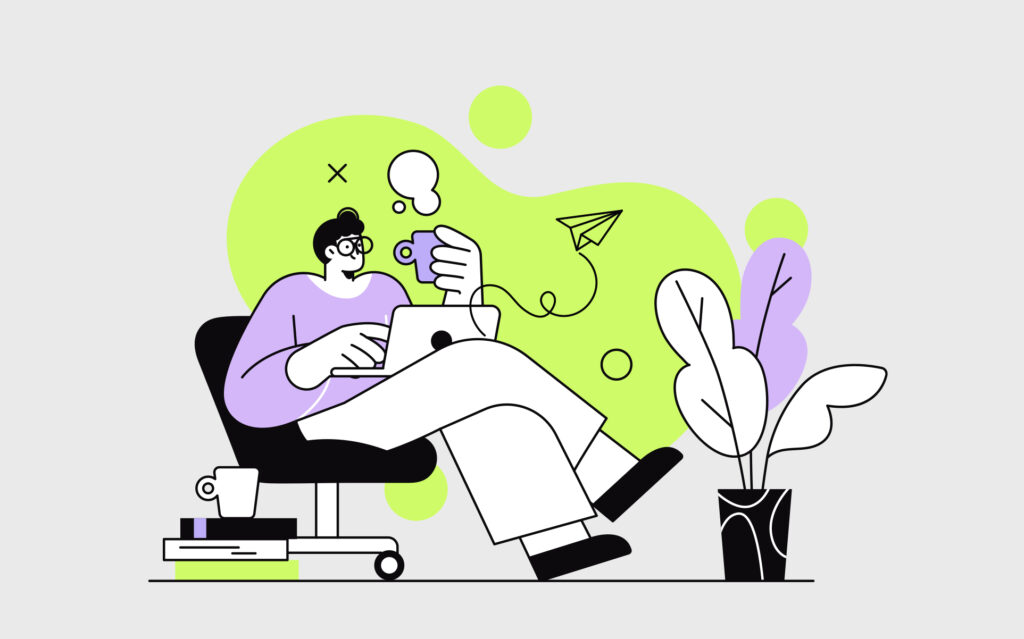
Many designers and design agencies are turning to minimal line art to create illustrations that are humorous and fun to convey a message. The simplicity of the line art lends itself to a cartoonish style, which is why the trend is a natural fit for more light-hearted projects. And because these drawings are so minimal, they can handle ultra-bright colours without overwhelming the viewer. To enhance the retro effect, many designers pair these illustrations with throwback bubble fonts and design features reminiscent of vintage magazine ads, such as oval borders and starburst stickers.
More recently, creators have combined more colourful palettes with that traditional minimal style. This concept has become an advantage, because it opens up more creative opportunities. Marketers find the simplicity more effective at conveying messages. This might be because there aren’t too many elements involved. Simple lines and patterns go well with muted colours to give a design some life without overdoing it.

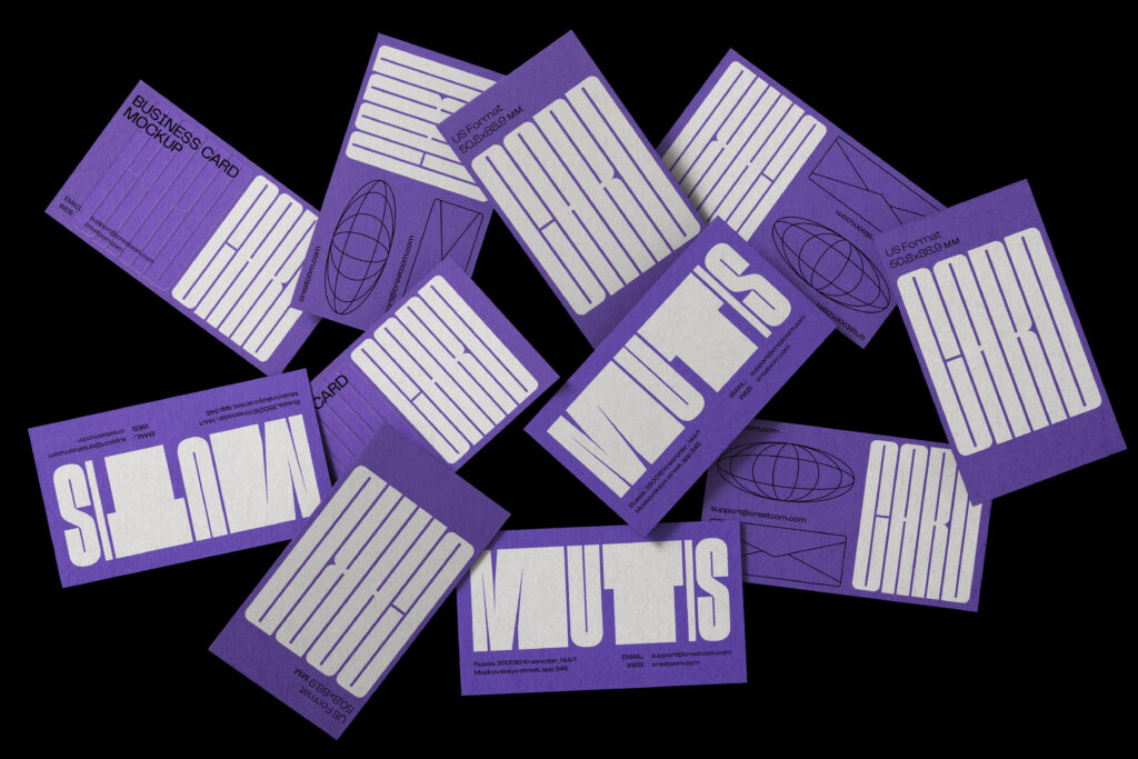
5. Experimental typefaces
Typography is one of the most important elements of graphic design. While text is primarily used to convey a message, designers are pushing the limits on how far they can go to put some extra character into those letterforms.
Display fonts and serif fonts are taking centre stage as we as we experiment with how far legibility boundaries can be pushed while maintaining clarity. Display fonts can vary significantly, but we predict a rise in fonts with soft organic shapes. Best advice here is, don’t do it, if you want your business to reach the dizzy heights of success, get yourself a good designer that knows the market. They will offer you far greater results and yield better results.

6. Prominent and bold photography
Photography is a big part of branding. It’s important to use photography that fits the message you’re trying to communicate. In the past, this has often meant using stock photos that are flat and don’t resonate to real people. But now, more and more designers are using their own original photography or finding creative ways to use existing photos.
7. Motion design
You might know this or not, but the average attention span of humans is shrinking at an enormous pace. It is now less than seven seconds, and keeping the audience engaged is more difficult than ever. To tackle this, marketers and animators are coming up with more creative ideas to enhance the visual experience, ultimately contributing to new trends with every passing year.
Motion graphic design is the art of creating moving scenes with graphics, animation, text and special effects. On a deeper level, movement creates identity, just like how we can identify a salsa dancer versus a hip-hop dancer. The dancer could be the same, but their motion tells the story. It’s a process that combines graphic design and animation to communicate ideas and messages that can be both entertaining and informative, depending on what the goal is.

