Insight – 08/01/2024
A logo is a symbol or design that represents a company, organisation, or product. It’s a quick and recognisable representation of a brand that helps consumers identify and differentiate it from competitors. Logos typically contain images, typography or a combination, and color schemes that are carefully chosen to reflect the brand’s values, personality and message. They can be printed on a variety of marketing collateral, products, and even physical locations like storefronts and vehicles. An effective logo will be memorable, simple, timeless, and versatile. Over time, logos can become synonymous with their brands, inspiring brand loyalty and recognition among consumers.
A good logo is important for a company because it represents the brand identity of the company. It’s the visual symbol that people associate with a company, and it helps to create an emotional connection between the brand and its customers. A well-designed logo can help a company to stand out in a crowded marketplace, communicate its values and personality, and create a sense of recognition and familiarity. A good logo must be simple, memorable, timeless, versatile, and reflective of the company’s message and values. It’s a crucial aspect of marketing, as it’s often the first thing people see when they encounter a company, and it can determine whether or not they choose to engage with the brand. Ultimately, a memorable logo can increase brand recognition, strengthen brand loyalty, and contribute to the success of a company.
In the ever-evolving world of logo design trends, one thing is clear: 2024 promises to bring fresh creativity to the forefront. The influence of AI is breathing innovation into the art of branding and revitalizing established concepts. It’s as if we’re entering a new, exciting hybrid era of design.
Whether you’re embarking on a new business venture or considering a logo redesign for 2024, remember that your logo is the beacon of your brand’s identity. It’s the face that your audience recognizes and associates with your business. Whether you collaborate with a skilled designer or harness the power of a free logo maker, ensure that your logo not only represents your brand but also has the flexibility to grow and evolve alongside your business.
So what are the most important elements of a good logo design in 2024?

1. Simplicity
The best logos – the ones that give the viewer an immediate and clear sense of “you” – are clean and uncluttered. In general, less is more and simplicity is more impactful.
Remember that logos are used in a variety of ways, on different platforms and in various formats and sizes, so fine details will be lost. A strong logo will have few elements, each of which can be identified easily and integral to what you’re hoping to communicate. If you have elements that don’t contribute to the whole, get rid of them.
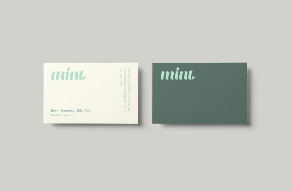
When it comes to logo design, less really is more. Colour is an important part of design, and by selecting just one colour, your brand is more likely to become synonymous with it (Think Coca Cola and Facebook). These companies have stuck consistently to one colour and as a result it has been absorbed into the consumer consciousness and has become part of their brand. What’s more, a one-colour logo will work better when embossed or embroidered on company clothing.
The minimalist style of quality design is often timeless. Take a look at the Chanel fashion house logo. Chanel is a symbol of modern business that always keeps pace with the times, and yet, they are represented by a simple typographic logo. Their logo has changed minimally over time, which shows that the design is almost perfect. Such a logo is not in danger of changing trends precisely because its simple appearance does not serve only one time and style. The passing of time does not affect simple designs, so they are always modern. That is why, after all, a fashion house does not ask for any more modern look for its logo than this simple one.
2. Flexibility
Today more than ever, logos must be both flexible and scalable for multiple applications, from the required mobile websites to uniform embroidery, which is specialized. They must work in one color as well as full color, and the logo designer should provide the company’s logo in various formats, such as square, horizontal, vertical, and icon only. Intricate details, such as overlapping elements and color gradients, can get lost if the logo is too complicated. For these reasons, logo marks should be designed for scaling to all the different sizes and shapes required for digital marketing on social media, websites, as well as physical printed media, such as business cards, signage, and brochures.
Your logo will be used in all your branding assets, from the header of your website to your business cards. Regardless of where your logo appears, your text should always be readable. To ensure this, take note of the text size and font that you use, and check the final result on various platforms (Facebook, Twitter, Instagram, etc.), and from different devices (desktop, smartphone, tablet, etc.)
Logos that are too detailed or intricate may be challenging to scale down to a smaller size. There is no “one size fits all” for logos, but ensuring that your logo is a high resolution vector that can be adapted to various sizes and file types means it will look good in any setting. If you want to familiarize yourself better, you can read more about logo sizes for various contexts. You can also check out some real life logo examples, designed by us here.
3. Brand appropriate
A logo should not only reflect the company for which it stands; it should reflect its target audience, too. If your audience is middle-aged male gun owners who take part in the annual deer hunting season, your logo should be designed to appeal to them, with elements that suggest things like ruggedness, nature/outdoors, camaraderie, strength, etc.
Understanding your meaning and value to customers and prospects can help you pinpoint what look you want to achieve based on what you stand for (or should stand for). If you’re not sure, ask yourself what makes your company better than competitors; better yet, ask your customers.
Depending on your product or service, your competitive advantage might be speed, authentic old-world craftsmanship, precision, attention to detail, reach, intelligence, variety, coolness, good health, power, innovation, elegance, efficiency or one of a thousand other characteristics.
4. Balance & proportion
A balanced design is pleasing to the eye and tends to be more effective. Whether it’s symmetry or asymmetry, a well-proportioned logo can create a sense of harmony and cohesion.
Everything that we see in a design has its own visual weight. For example, colors and fonts are two different elements having their own usefulness. But the problem of balance arises when one element dominates the others heavily in a graphic design, creating an unbalance.
Logos that are well-balanced appear harmonious and polished. Nothing is shifted too much to one side of the design or the other. When your design is off-kilter, it can appear too chaotic and make it difficult for the viewer to absorb all the information at once.
Alignment, spacing and symmetry are all important parts of achieving balance in your logo. For example, while there seems to be a lot going on in the above composition, these three factors are what prevents it from feeling overwhelming.
The principles of visual hierarchy in logo design are essential tools for creating logos that are not only visually striking but also effective in conveying a brand’s identity. By skillfully applying contrast, size, color, typography, repetition, and balance, a logo can become a powerful symbol that encapsulates a brand’s essence and values. It’s the thoughtful application of these principles that elevates a logo from being just an artistic creation to a vital element of a brand’s identity, ensuring it resonates with the audience and stands the test of time.
5. Vector format
Professional graphic designers always design a logo in a vector format, since they are mathematical equations that make a logo more scalable and easier to resize.
These file formats are mostly used to create logos, and other branding and printing materials. They are most commonly created and edited with Adobe Illustrator, which is a vector-based program, famous for its endless, easy-to-use tools and practicability.
Vector graphics are comprised of formulaic curves. Due to a vector’s mathematical makeup, each path, line, or curve looks precise at any size. These complex shapes and lines can be produced exclusively in vector-based programs, such as Adobe Illustrator or Sketch. Raster-based programs such as Adobe Photoshop cannot produce vectors.

6. A memorable icon
The logomark is the icon, pictogram or graphical element of a logo design. It is generally the most recognizable part of a logo, meant to encapsulate the entirety of the brand in a singular image. It accomplishes this through symbolism, shape language, color theory, and design principles—communicating traits to the viewer on a subconscious level. Often, it acts as an avatar, meaning it stands alone for the brand in certain contexts when the other elements of the full logo are absent.
In logo design, an icon is a symbolic representation or image that conveys a message or meaning to the viewer. Icons are often used alongside text elements in logos to reinforce the brand identity or to make the logo more recognizable and memorable. They can be abstract or concrete, and are designed to communicate specific values or characteristics associated with the brand. Effective icons are simple, memorable, and unique, allowing them to stand out in a crowded field of logos. Icons can also be used on their own, apart from a logo, as a brand identifier in contexts where the full logo may not be appropriate or visible. Overall, icons are an important component of logo design, helping to strengthen the brand image and message.
Today, it is impossible to start designing a logo without keeping in mind social networks and mobile applications, ie how that future logo will look in the extremely simplified form needed for platforms such as social media feeds or, as we mentioned, mobile applications. This simplified form of the logo is the icon logo form.